What is Financial Data Visualization? Take moomoo as Example

In today's fast-paced financial markets, understanding complex data is crucial for making informed investment decisions. Financial data visualization is a powerful tool that transforms intricate numbers and statistics into easy-to-understand graphical representations. For Canadian investors, who often juggle multiple investments and need to stay updated on market trends, data visualization can simplify the process of analyzing financial information.
By turning raw data into visual insights, investors can quickly grasp patterns, trends, and potential opportunities, enabling them to make strategic choices with greater confidence. This article will use moomoo as an example to show you what financial data visualization is and to help you gain better understanding.
What is financial data visualization?
Financial data visualization is a technique and method that presents complex financial data through intuitive visual elements such as graphs, charts, and maps. Its goal is to transform large amounts of abstract financial data into visual forms that are easy to understand and interpret. This helps financial professionals, managers, investors, and other users quickly and accurately grasp the essence and trends of financial information. By using various chart types like bar charts, line graphs, pie charts, and dashboards, financial data visualization can clearly display relationships, comparisons, trends, and distributions within financial data.
For example, it can show changes in sales trends over different periods, the cost distribution among departments, or the structure of assets and liabilities. This visualization approach not only improves the readability and comprehensibility of data but also helps users identify patterns, anomalies, and potential issues within the data, thus providing strong support for decision-making and enhancing the efficiency and accuracy of those decisions.
Common types of financial data visualizations
Financial data visualizations come in various forms, each serving a unique purpose in presenting data clearly and effectively. Here are some common types:
1. Line Charts: These are used to display data points over time, making them ideal for tracking trends, such as stock prices or revenue growth. They help investors and analysts observe fluctuations and patterns over specific periods.
2. Bar Charts: Useful for comparing quantities across different categories, bar charts can represent financial metrics like sales figures across different regions or product performance within a company. They provide an easy way to see relative sizes at a glance.
3. Pie Charts: These charts show proportions and percentages, making them suitable for illustrating the composition of financial elements, such as expense distributions or market shares. Each slice represents a part of the whole, helping users quickly understand the breakdown.
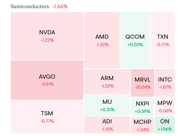
4. Heat Maps: These visualizations use color to represent data values, making them effective for displaying the performance of various financial instruments or sectors. For instance, a heat map can show which stocks are performing well or poorly in a portfolio.
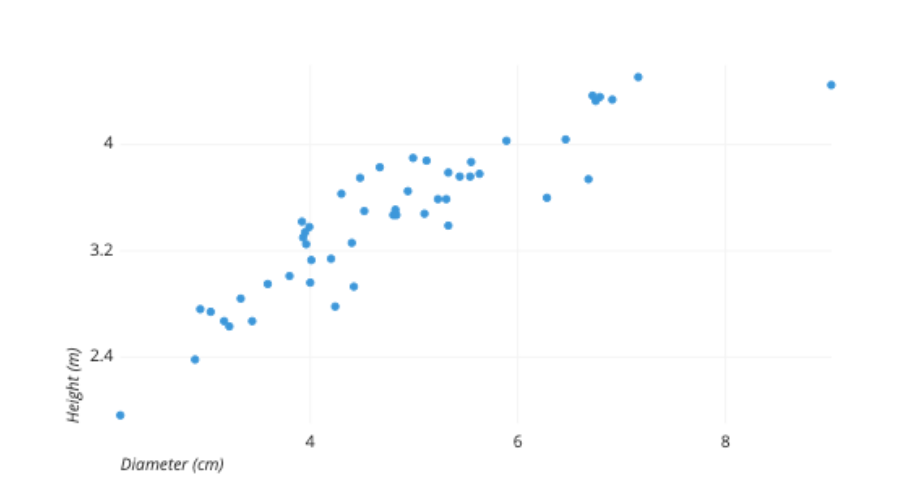
5. Scatter Plots: Used to examine relationships between two variables, scatter plots can reveal correlations or patterns, such as the relationship between risk and return for different investments.
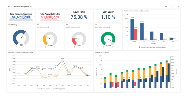
6. Dashboards: These comprehensive visual tools combine multiple charts and graphs to provide an overview of key financial metrics in one place. Dashboards are often interactive, allowing users to drill down into specific data points for deeper analysis.
7. Candlestick Charts: Commonly used in stock analysis, these charts display opening, closing, high, and low prices for a specific time period. They help traders identify price patterns and potential market movements.

Why is financial data visualization important?
On one hand, it presents complex financial data intuitively and simplifies interpretation. Businesses often have vast amounts of financial data, such as numerous data points in large corporate financial statements. Bar charts can compare departmental expenses, line graphs can show revenue trends, maps can illustrate the financial status of multinational company operations across regions, and pie charts can display cost structures. This makes it easy for non-financial professionals to understand the relationships and compositions within the data.
On the other hand, it plays a significant role in decision-making and communication. For decision support, it helps decision-makers quickly detect trends and anomalies in the data. For example, fluctuations can be identified and addressed through cash flow line graphs, and investors can make buying and selling decisions based on stock-related visual data. It also aids in strategic planning by using dashboards to assess a company's financial status and set strategic goals.
In terms of communication, internally, different departments can efficiently communicate through visualized reports, such as using bar charts to display product gross margins to facilitate communication between sales and production departments. Externally, it effectively conveys information to investors and other stakeholders, enhancing trust and persuasiveness.
Financial data visualization example by moomoo
moomoo Canada is a popular stock trading platform that allows Canadian investors to easily trade US and Canadian stocks. Compared with other trading platforms, moomoo offers low trading fees, which can reduce costs for investors and increase the potential for investment returns. Additionally, it implements a zero account management fee policy.
In terms of the trading experience, moomoo excels with a user-friendly interface design that allows both novice investors and experienced traders to navigate and use the platform with ease, facilitating a more convenient engagement in various financial trading activities.
moomoo Canada also pay attention to financial data visualization. This section will delve into how moomoo utilizes these visual tools to enhance understanding and insight into key financial aspects. We will explore three critical aspects: company valuation, financial indicators, and the income statement. Through these examples, we will demonstrate how moomoo's visualizations provide clarity and actionable insights, helping investors to efficiently evaluate company performance and make strategic investment choices.

Company valuation
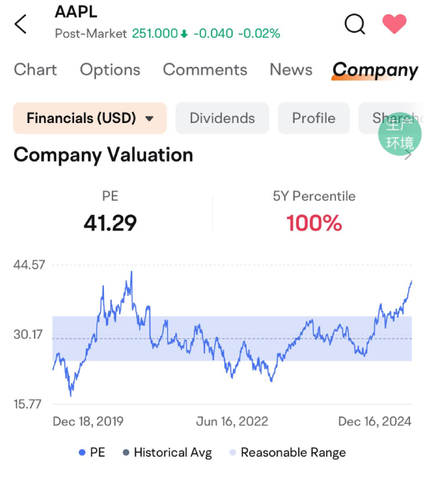
When investors trade individual stocks on moomoo, they can find a visualized financial data of the company by selecting "Company" and then clicking "Financials."
Firstly, let’s look at the company valuation. In terms of core data presentation, key information such as AAPL's after-hours trading price is clearly marked at $251.00, with an intuitive display of a $0.040 decline and a 0.02% drop, allowing investors to quickly grasp its real-time stock price dynamics.
In the "Company Valuation" section, critical valuation data such as a price-to-earnings (P/E) ratio of 41.29 and a 5-year percentile of 100% are directly listed, making key valuation information clear at a glance. The charts below are the core manifestation of visualization, with a timeline as the horizontal axis from December 18, 2019, to December 16, 2024, and the vertical axis representing indicators like the P/E ratio. The changes in P/E value, historical average, and reasonable range are shown with curves. This allows investors to visually observe the trajectory of P/E fluctuations over this period, clearly identifying that it is currently at a relatively high position, above both the historical average and the reasonable range.
This enables a quick understanding of Apple's valuation trend over a longer period and its current valuation standing within the industry. This visualization approach transforms complex financial data into easily understandable graphical language, significantly aiding investors in analyzing and making decisions about Apple's financial status.
You may also like: How to Buy US Stocks in Canada?
Financial Indicators
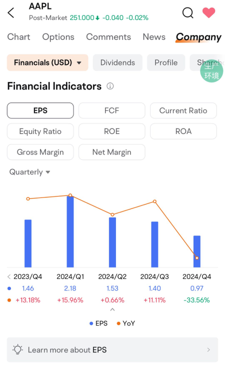
In the "Financial Indicators" section, the chart shows how Apple's earnings per share (EPS) changes from the fourth quarter of 2023 to the fourth quarter of 2024, and also shows the year-on-year growth rate (YoY).
From a visualization perspective, this chart format makes the data clear at a glance. By displaying the EPS values in a bar chart, you can intuitively compare the profit levels of each quarter. At the same time, using a line chart to show the year-on-year growth rate can clearly reflect the changing trend of profitability. Investors and analysts can quickly capture key information from the chart, such as Apple's obvious decline in profitability in the fourth quarter of 2024, and further explore the reasons behind it.
Income Statement

In the "Income Statement" section, there is a quarterly financial data chart that shows Apple's revenue from the fourth quarter of 2023 to the fourth quarter of 2024, with year-on-year growth rate (YoY).
From the perspective of revenue trends, the overall trend is fluctuating. After reaching a peak in the first quarter of 2024, it fell back and rebounded in the fourth quarter of 2024. From the perspective of year-on-year growth rate, there were ups and downs, reaching a relatively high year-on-year growth rate of 6.07% in the fourth quarter of 2024.
This presentation is for informational and educational use only and is not a recommendation or endorsement of any particular investment or investment strategy. Investment information provided in this content is general in nature, strictly for illustrative purposes, and may not be appropriate for all investors. Read more