How to interpret the Fed dot plot?

Understanding the Fed's moves is crucial for making smart investment decisions.
The Fed usually holds eight meetings each year and forecasts future interest rate paths at the end of each quarter's meeting.
It is famously known in the financial market as the "dot plot."
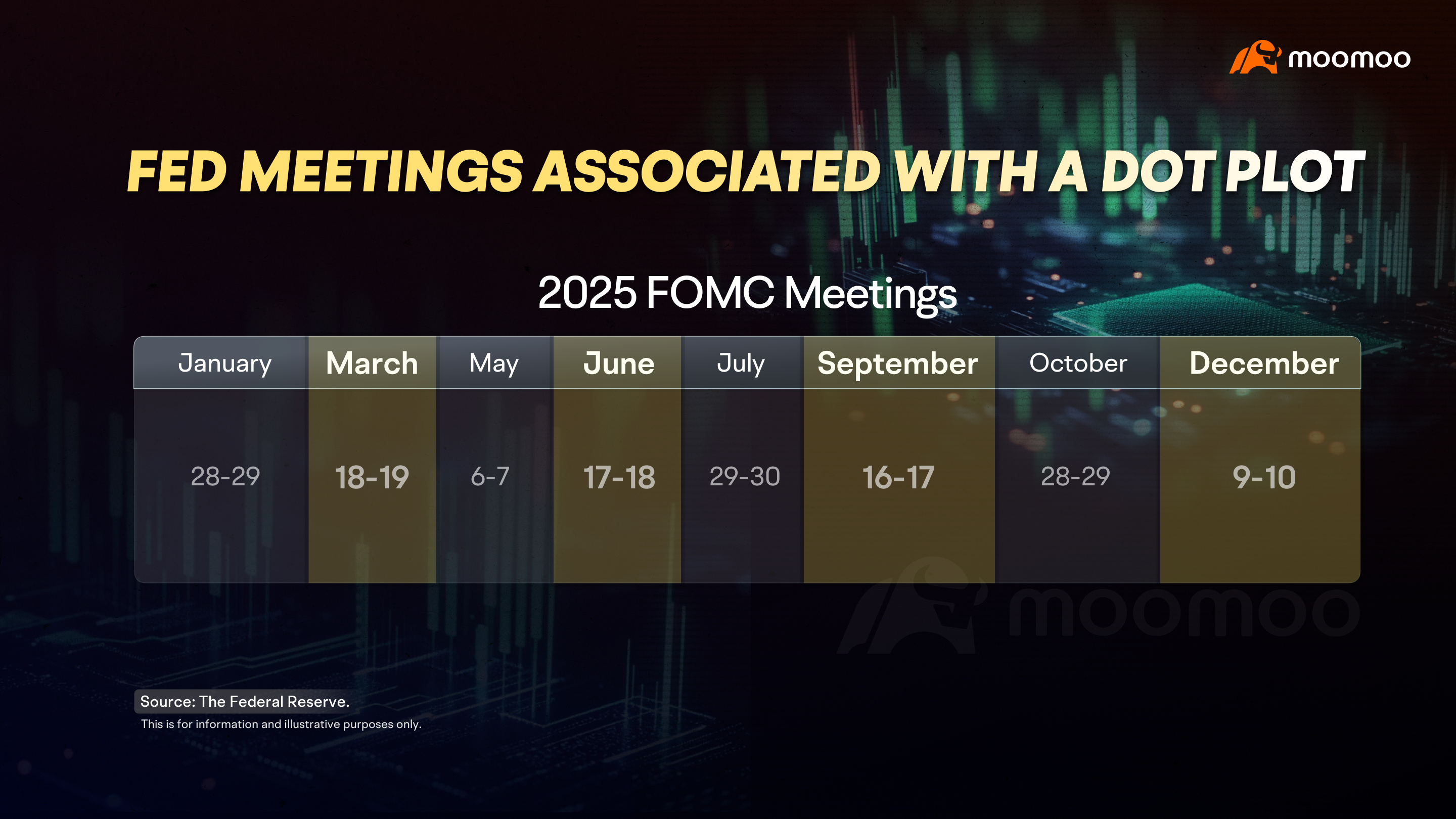
Takeaways:
The Fed dot plot visualizes interest rate projections, with dots representing each participant's prediction.
Clusters of dots show consensus, while scattered dots suggest varied opinions, especially for long-term forecasts.
The FedWatch tool estimates probabilities of rate changes, offering insight into market expectations.
1. Dot plot
At first glance, the dot plot might look like complex Morse code, but don't worry, it's not as tough to decode as it seems.
Let’s use the dot plot from the Fed’s December 2024 meeting as an example:
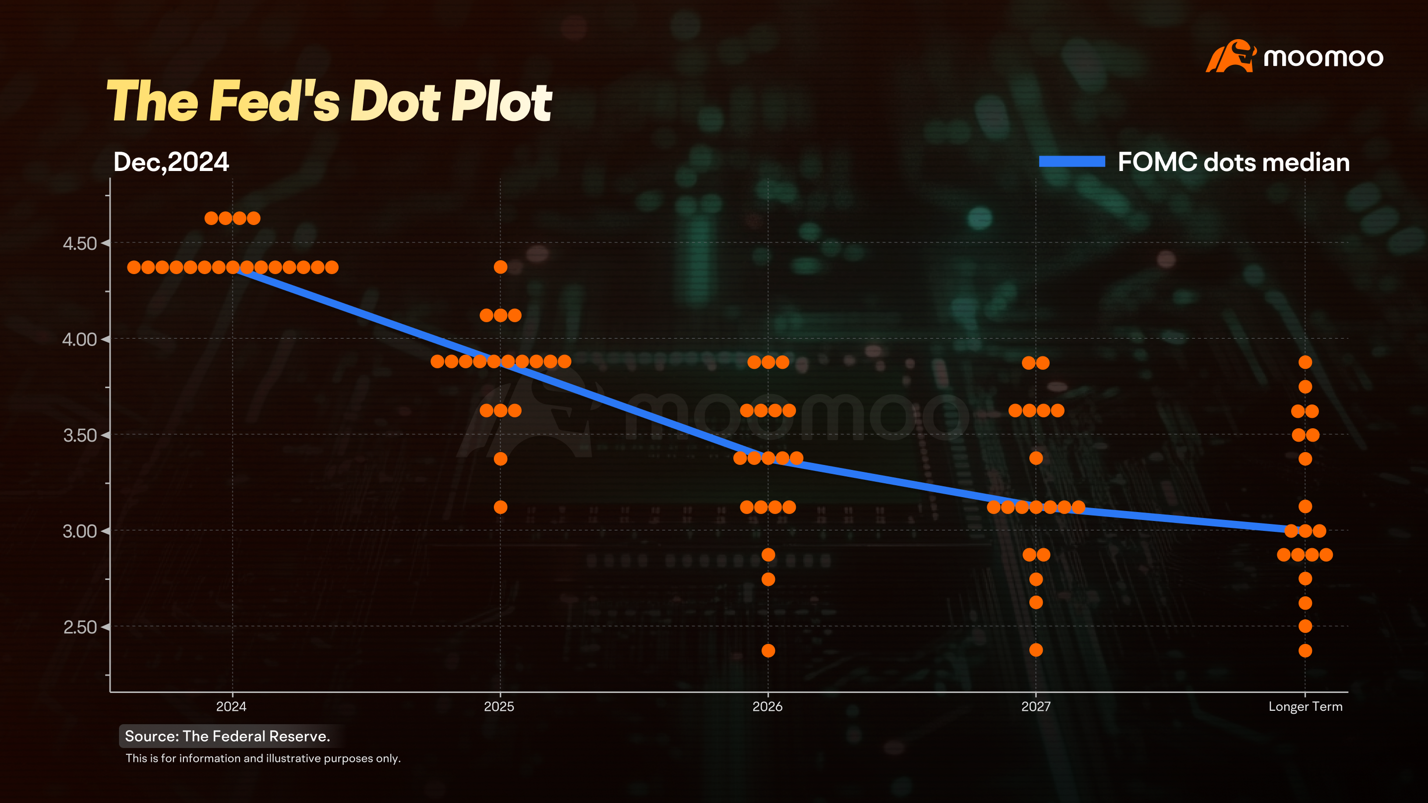
On the horizontal axis, you’ve got the years. The far left shows the latest interest rate decision, and as you move right, you’ll see the projections for the next three years and beyond.
The vertical axis shows specific interest rates, with each little box representing 0.25 percentage points, or 25 basis points (bps).
You might hear in the news about the Fed hiking or cutting rates by so many bps. Just remember, 1 percentage point equals 100 basis points.
Each dot represents a participant's prediction for future interest rates, and the median of these dots is seen as the Fed's "mainstream expectation."
If the dots are packed together, the decision-makers have a consensus. If they’re scattered, opinions are more varied. Usually, there’s more agreement on the current meeting, but things get more spread out as you look further into the future.
2. The FedWatch
Now, the market doesn’t just sit around waiting. It forms its own expectations about the Fed’s rate decisions, and a handy tool to check these expectations is the FedWatch.
It crunches the numbers from interest rate futures to show the probabilities of the Fed raising, holding, or lowering rates.
For instance, let's say it's March 2025, and the Fed's next meeting is on March 19th. The tool might show a 91% chance of rates staying at 4.25%-4.5%, with just a 9% chance of a cut to 4%-4.25%.
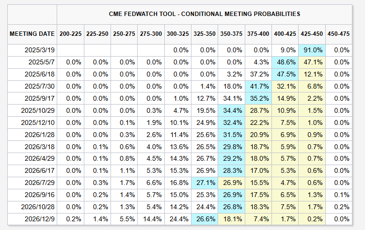
Source: CME FedWatch. Data as of March 7, 2025.
This is for information and illustrative purposes only.
It also forecasts future meetings, highlighting the most likely rate with a blue box. At that time, the market expected the Fed might drop rates to 4-4.25% in May.
Most of the time, the short-term expectations from the FedWatch Tool align with what the Fed does. But when you stretch the timeline, the market’s predictions don’t often match the Fed’s actions.
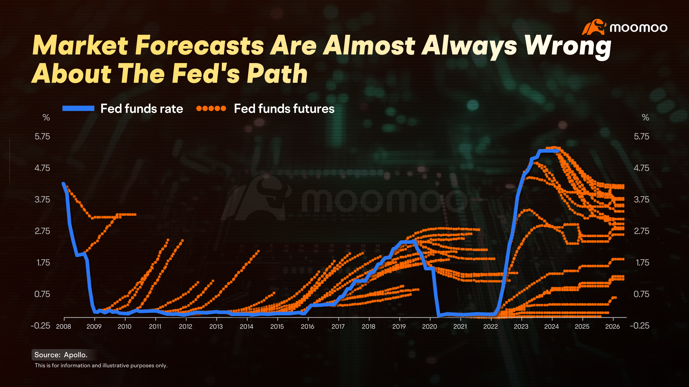
After the 2008 financial crisis, the Fed kept rates low for a long time, even though the market kept expecting hikes.
And after the rapid rate increases in 2022, the market anticipated future cuts, but rates stayed high.
That’s because the economy is a super complex system, and the longer the timeline, the more unpredictable events can pop up. Still, the tool offers us a valuable window into potential rate paths.
As the old saying goes, "You can't predict, but you can prepare."
That’s it for today’s session! If you found it helpful, give us a thumbs up, share it with your friends, and drop a comment below. Thanks for joining, and see you next time!
This presentation is for informational and educational use only and is not a recommendation or endorsement of any particular investment or investment strategy. Investment information provided in this content is general in nature, strictly for illustrative purposes, and may not be appropriate for all investors. Read more