A look at employment: what other indicators are there?
Just like inflation isn't just about CPI and PCE, the job market isn't just about non-farm payrolls.
A whole suite of indicators paints the employment picture: ADP, unemployment rate, initial jobless claims, and more. Let’s break them down and see how they change in different job market scenarios.

Takeaways:
Various indicators provide a comprehensive view of the job market
Discrepancies exist between ADP and non-farm payroll data due to different scopes and timings
A spike in unemployment usually signals economic pain
1. ADP: a miniature NFP
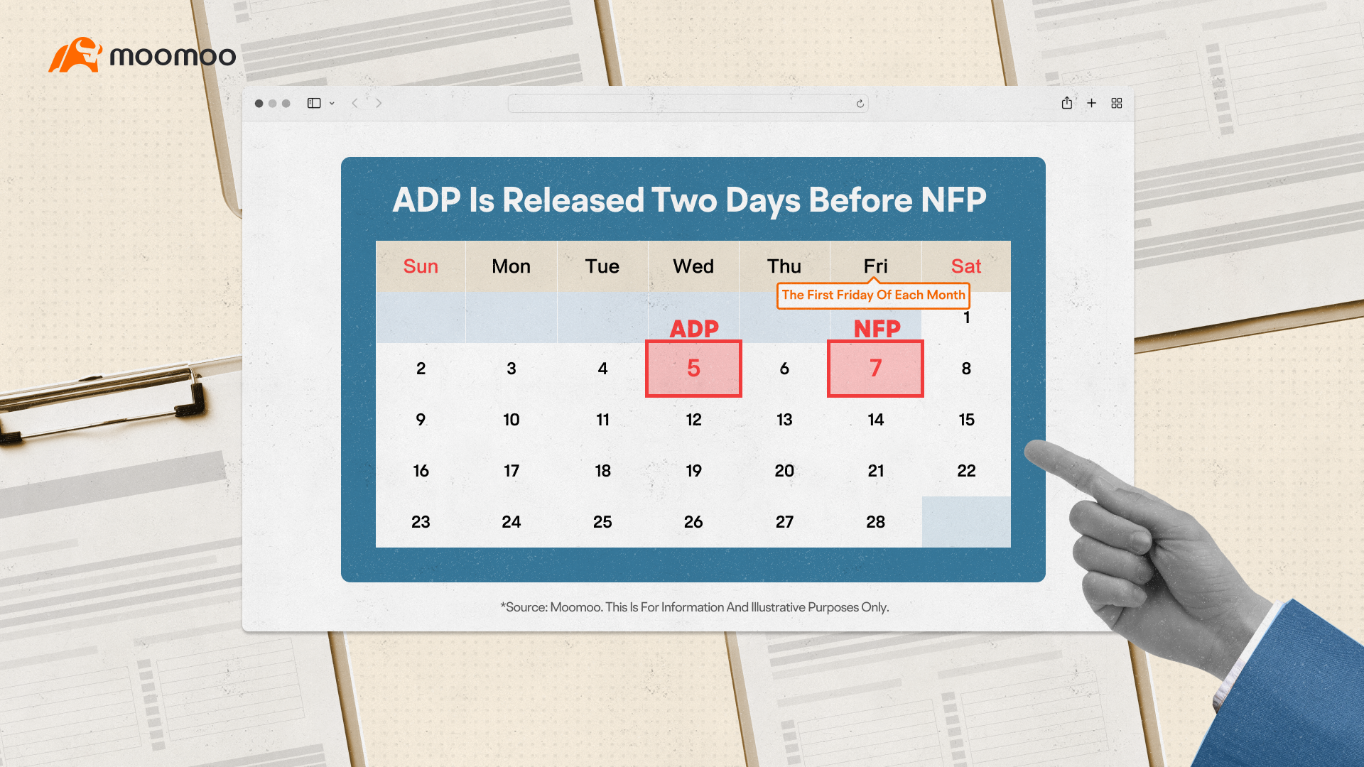
ADP refers to Automatic Data Processing, a well-known human resources company in the United States. ADP employment data covers roughly 500,000 private businesses using their payroll systems, giving us a snapshot of U.S. employment. It's released two days before the non-farm payrolls (NFP) and covers a narrower scope.
If you already know inflation indicators, does this look familiar?
In brief, the two leading consumer spending indicators are CPI and PCE. Although PCE is more comprehensive, the market often relies more on CPI data because it is commonly used internationally and released earlier.
Is it the same for ADP and non-farm payrolls? Not really!
While ADP and non-farm data trends align over the long haul, short-term discrepancies are common. Comparing these two sets for inflation and employment makes it quite intuitive.
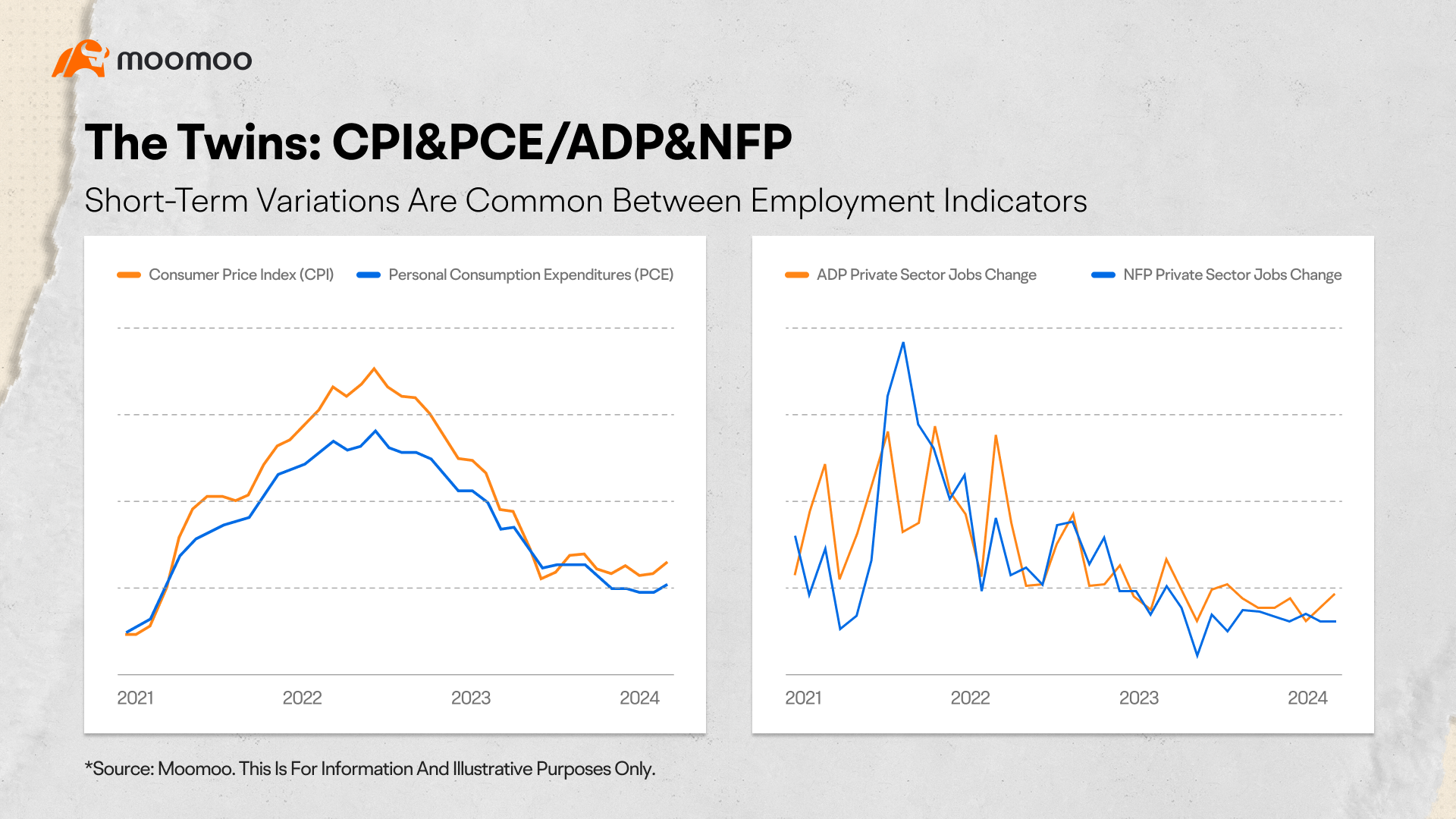
ADP data is company-released, while non-farm payroll is gathered by the Labor Department, with broader sampling. This can lead to conflicting data, but non-farm payrolls usually serve as the more decisive factor.
Plus, with just a two-day gap between ADP and non-farm releases, the market is willing to wait for more comprehensive data. Meanwhile, CPI and PCE have more than a two-week gap between their releases, making CPI the go-to data for a quicker read.
2. Unemployment rate
The unemployment rate might be the most familiar employment indicator for the public. The Department of Labor compiles and releases it concurrently with the non-farm payroll report.
A spike in unemployment usually signals economic pain. The unemployment rate rose significantly during the 2008 financial crisis and the 2020 COVID-19 pandemic. In 2020, it was about to reach 15%. With various government stimulus plans and the pandemic's effects receding, it significantly declined afterward.
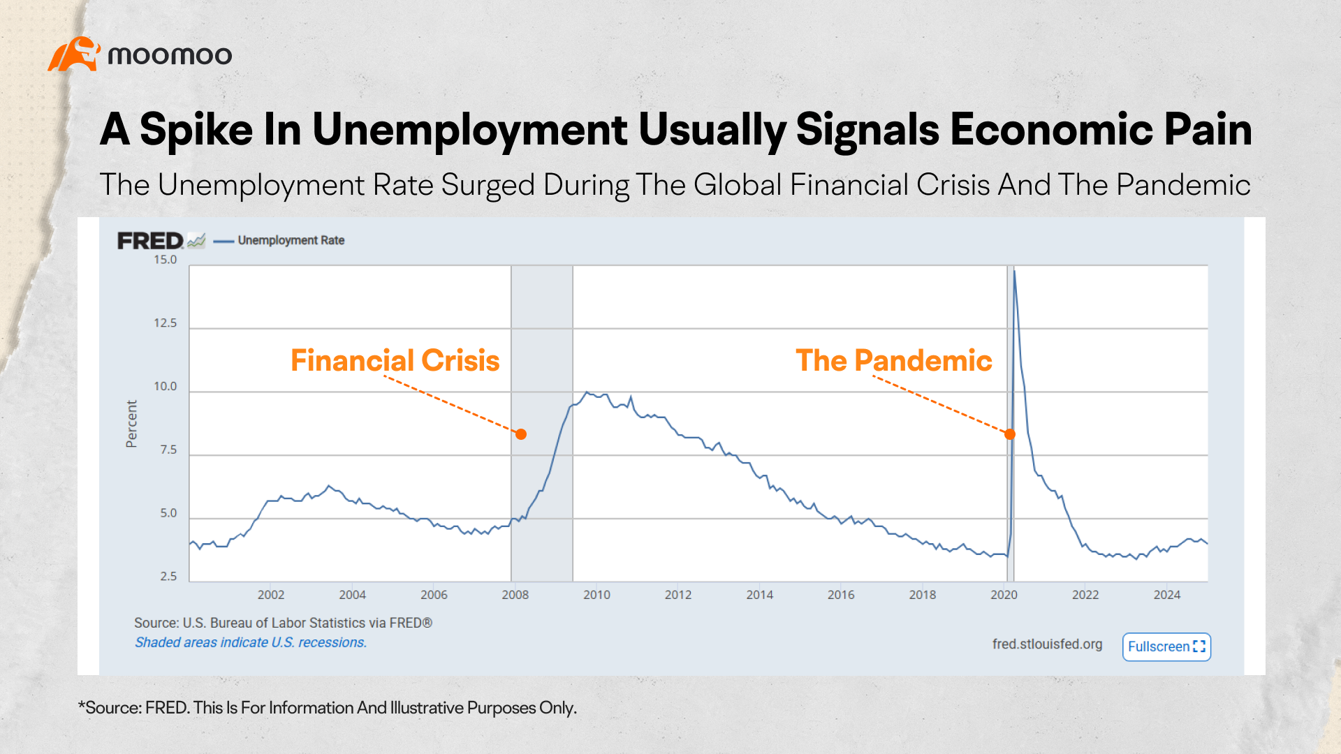
Generally, an unemployment rate below 5% can be considered full employment; a rate between 5% and 10% indicates a relatively weak labor market, and if it exceeds 10%, it may affect consumer demand.
High and sustained unemployment rates marked the Great Depression. In 1933, the first year of President Roosevelt's term, the unemployment rate reached a staggering 25% and remained above 20% for the next two years.
But, a lower unemployment rate is not always better. Extremely low rates can hint at rising inflation.
With most people having jobs, companies face stiffer competition for workers, potentially sparking the "wage-price spiral." In early 2023, the U.S. unemployment rate hit a 50-year low, mirroring the high inflation.
Alongside the monthly unemployment rate, we have weekly initial jobless claims, a report that shows the number of people who applied for unemployment benefits for the first time.
Released every Thursday, this data can be volatile, influenced by holidays and weather. However, major deviations from expectations might signal significant job market shifts.
3. How do employment indicators move?
Now that you know the key employment indicators, let’s take a quick test! If the job market is thriving, how would these indicators move?
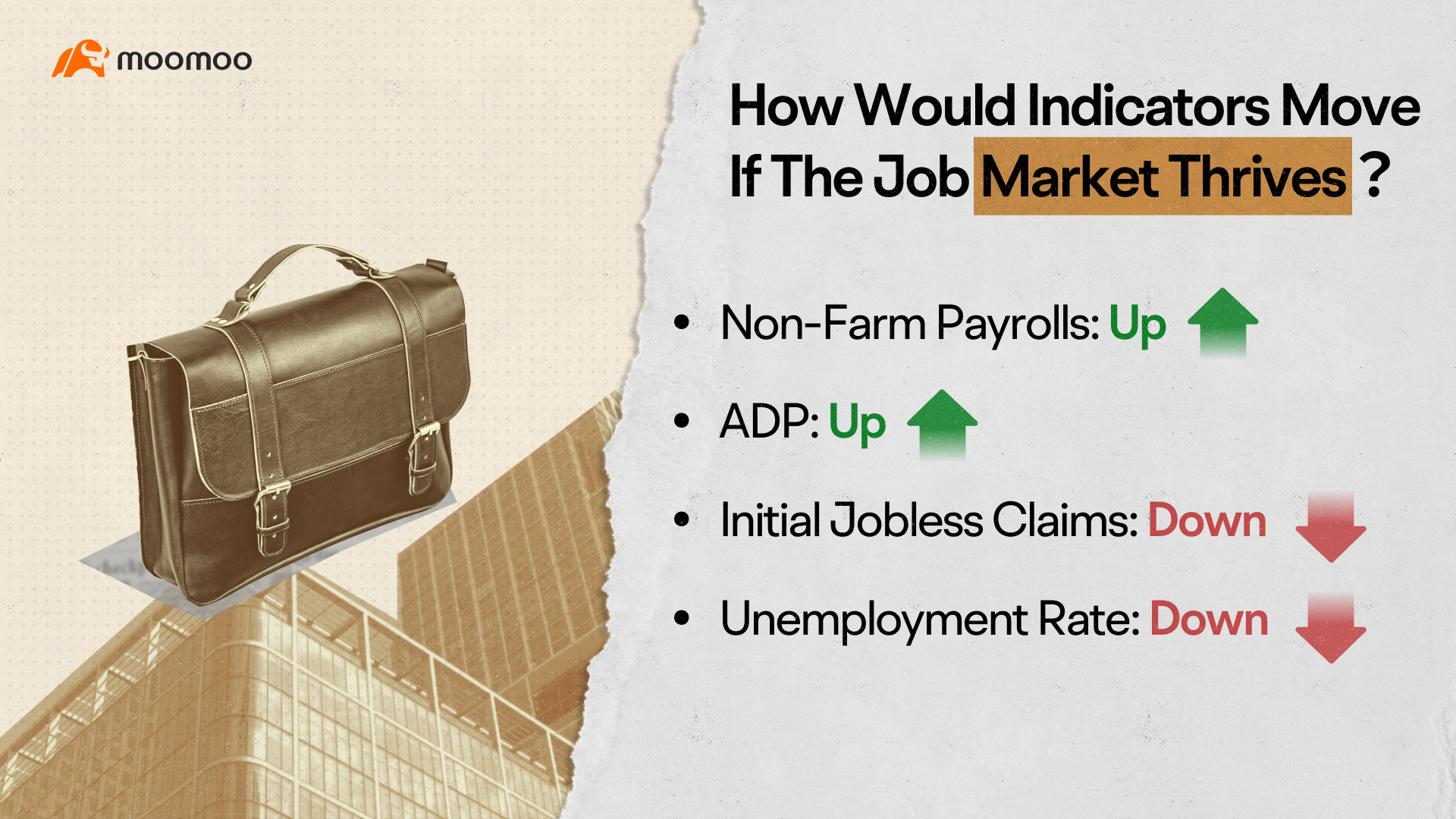
Here's a quick rundown:
In a strong labor market, job-related indicators typically rise, while unemployment-related metrics fall. If the job scene sours, expect these indicators to shift in the opposite direction.
With moomoo, you can easily check out these employment indicators. Head to Markets and swipe up to Economic Calendar to find upcoming data releases. Use the search box for specific indicators and dive into details like release dates, historical trends, and past data.
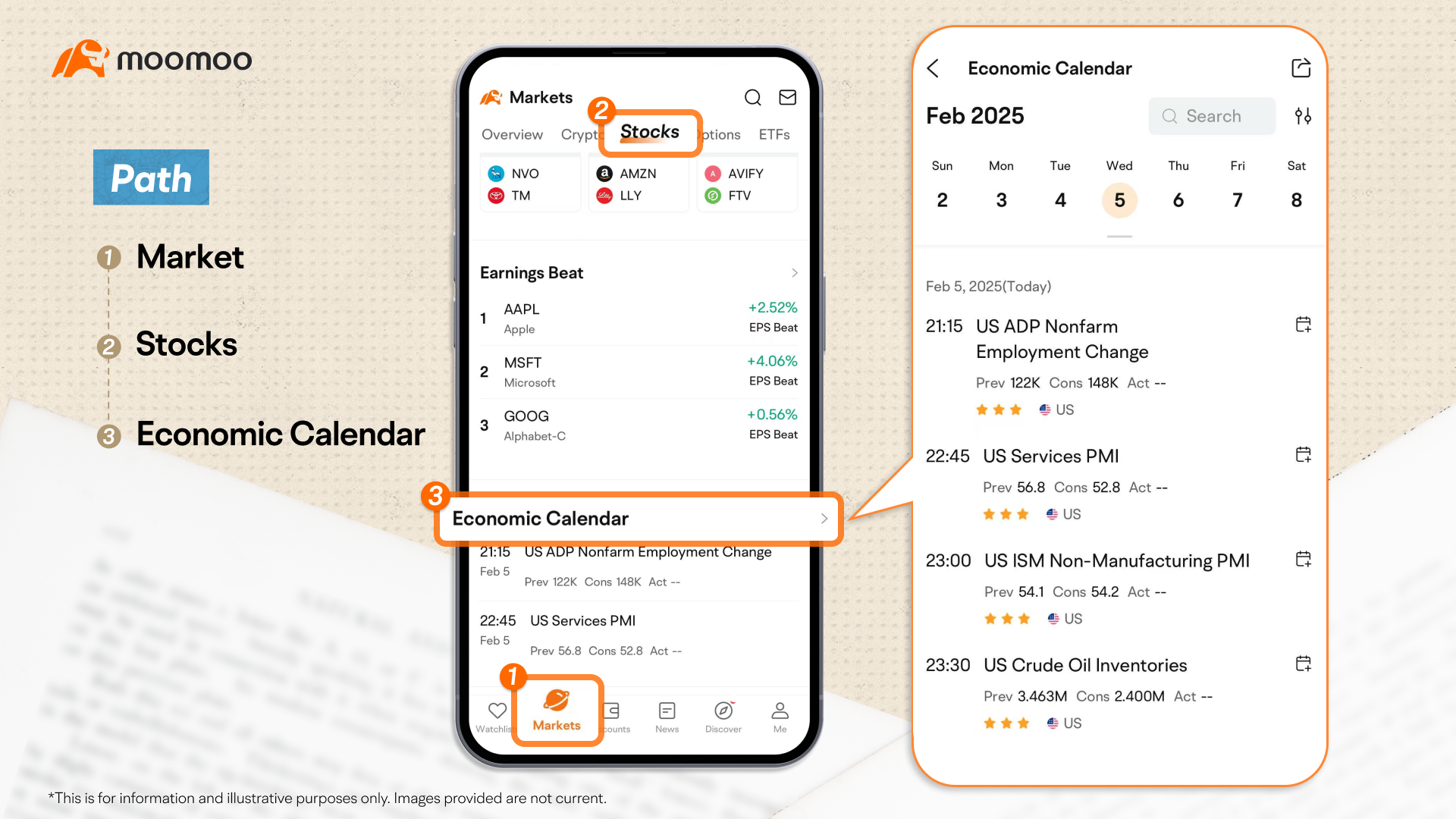
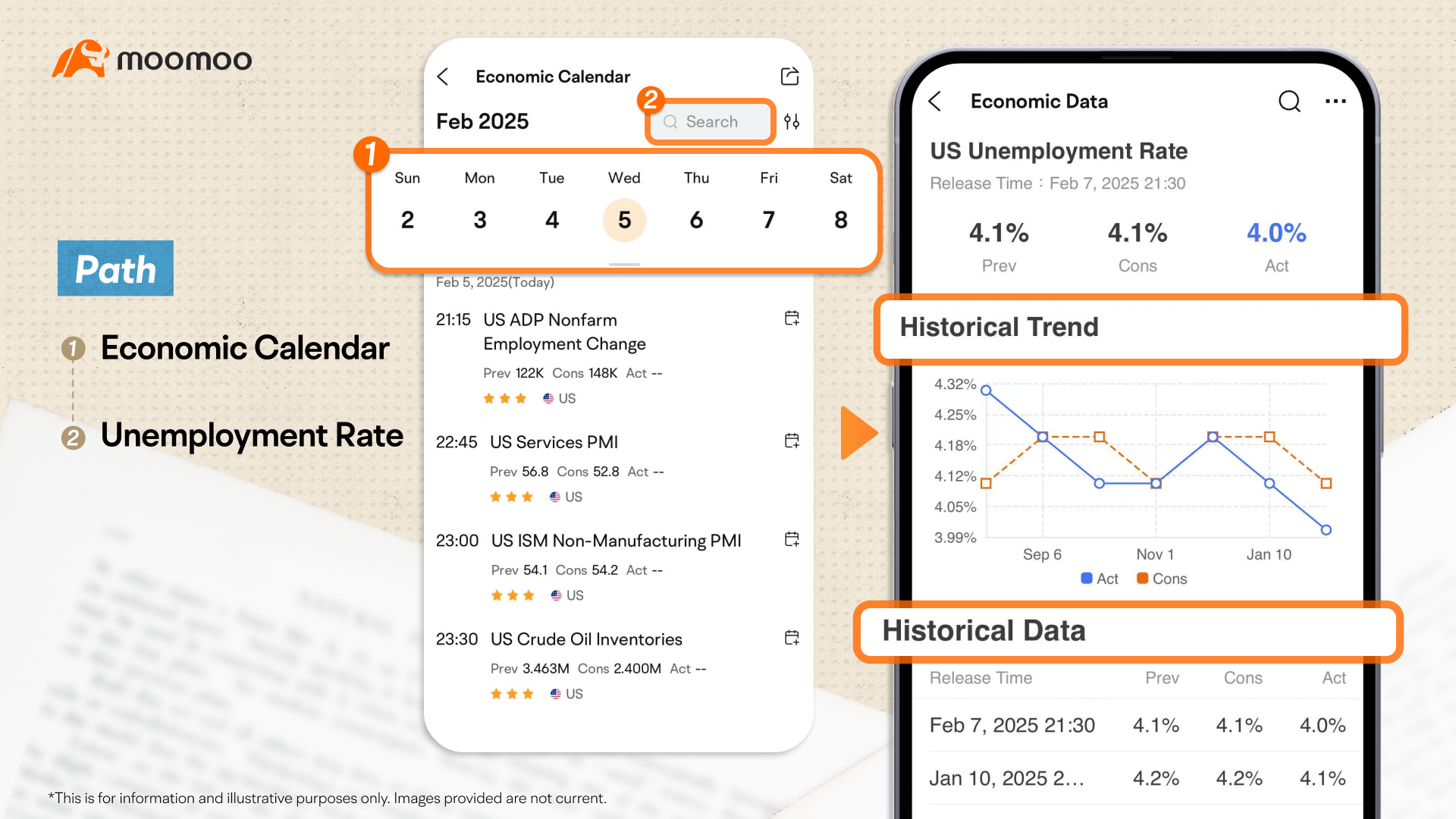
If you’re worried about missing any release times, just click the calendar icon to subscribe. You’ll receive notifications as soon as the data is released, so you'll always be in the loop.
And that's a wrap for this macro lesson! If you found it helpful, don't forget to like, share, and leave a comment. Thanks for joining, and see you next time!
This presentation is for informational and educational use only and is not a recommendation or endorsement of any particular investment or investment strategy. Investment information provided in this content is general in nature, strictly for illustrative purposes, and may not be appropriate for all investors. Read more