Master two key indicators to assess future market trends.

In the previous chapter, we learned how to value stocks.
So, what are the factors that influence stock prices?
Broadly speaking, these include fundamental factors on one hand, and technical factors on the other.
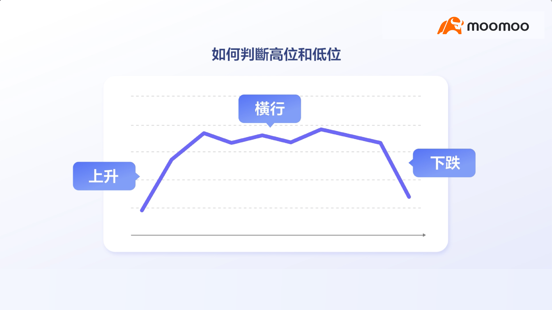
It is perfectly normal for stock prices to fluctuate.
Even excellent companies experience periodic volatility.
This raises the question: How can we identify price highs and lows?
Nearly all market participants attempt to find the correct answer.
Among the various analytical methods, technical analysis is widely used.

Technical analysis encompasses a wide array of tools.
Let us begin with the most basic and commonly used tool: candlestick charts.
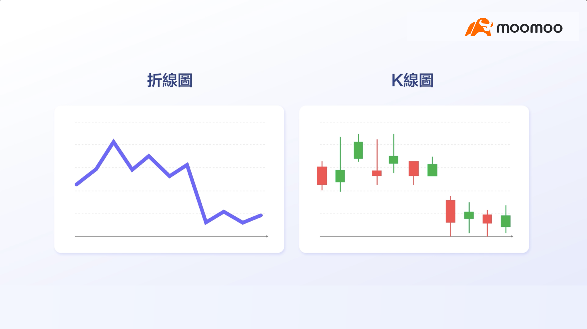
When you examine the price chart of a stock, you will notice that price movements are often not displayed as line charts.
Instead, price movements are presented using so-called "candlestick charts," as they convey richer information.
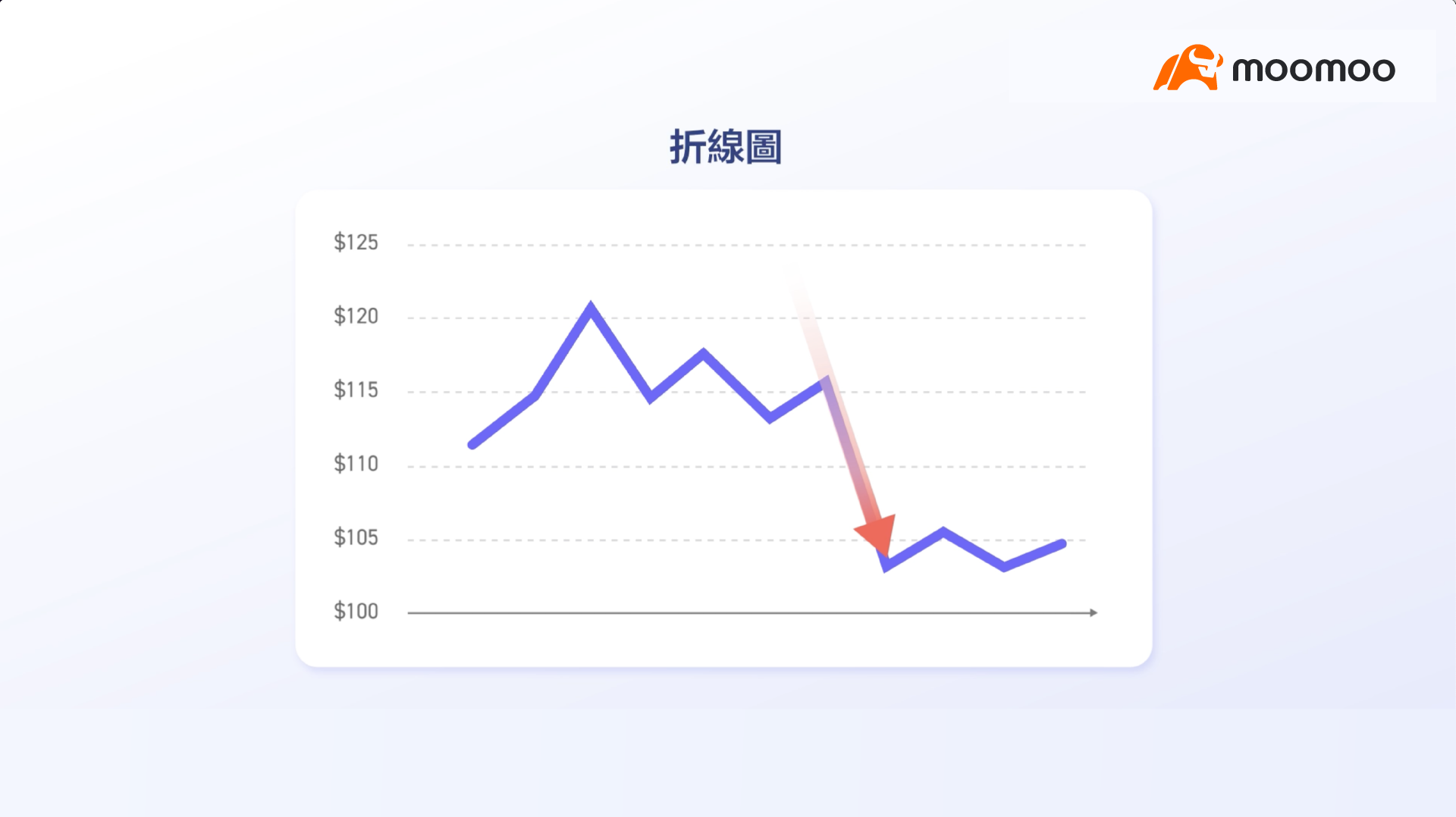
Let us first take a look at this line chart.
What information can you derive from the chart?
Clearly, there was a significant drop in the stock price. Is that all?
The answer is open to debate.
In fact, to gain a more comprehensive understanding of stock price dynamics, we can use candlestick charts.
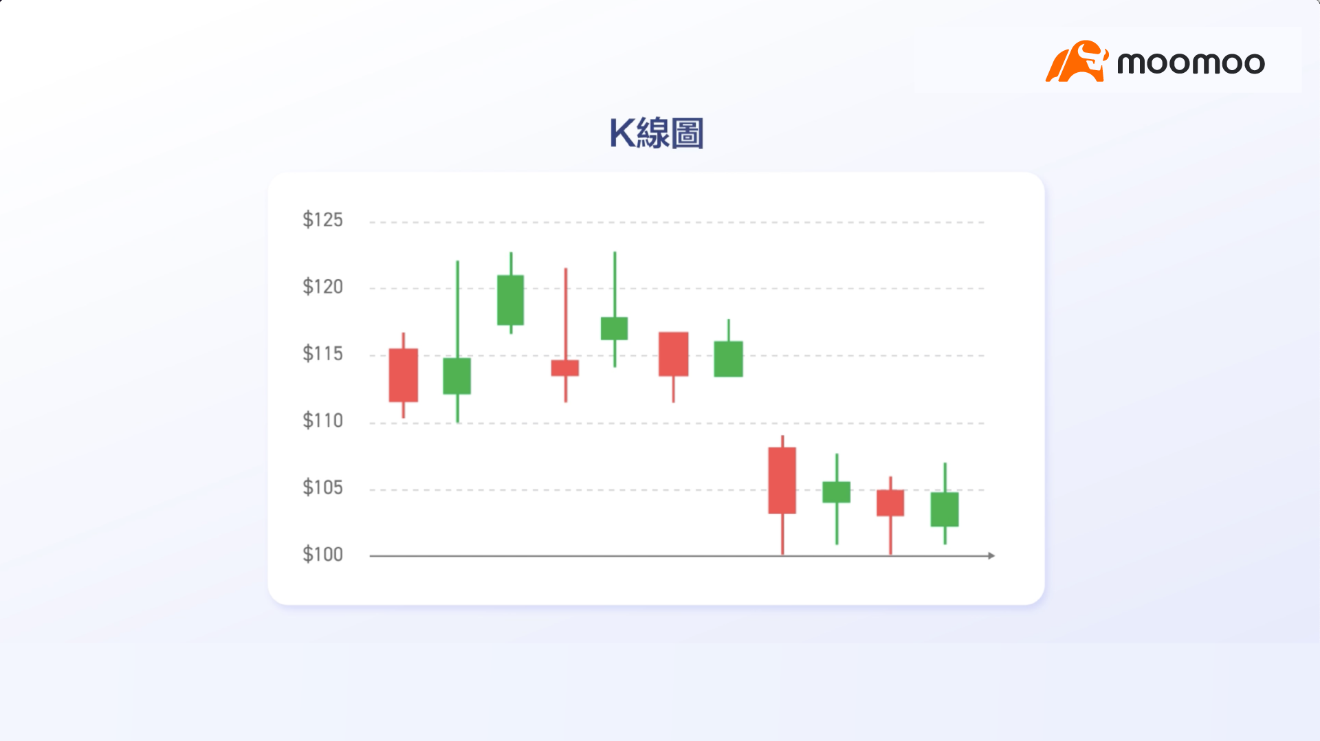
Through the candlestick chart, we observe that the stock price attempted to break below the $100 level multiple times but rebounded each time.
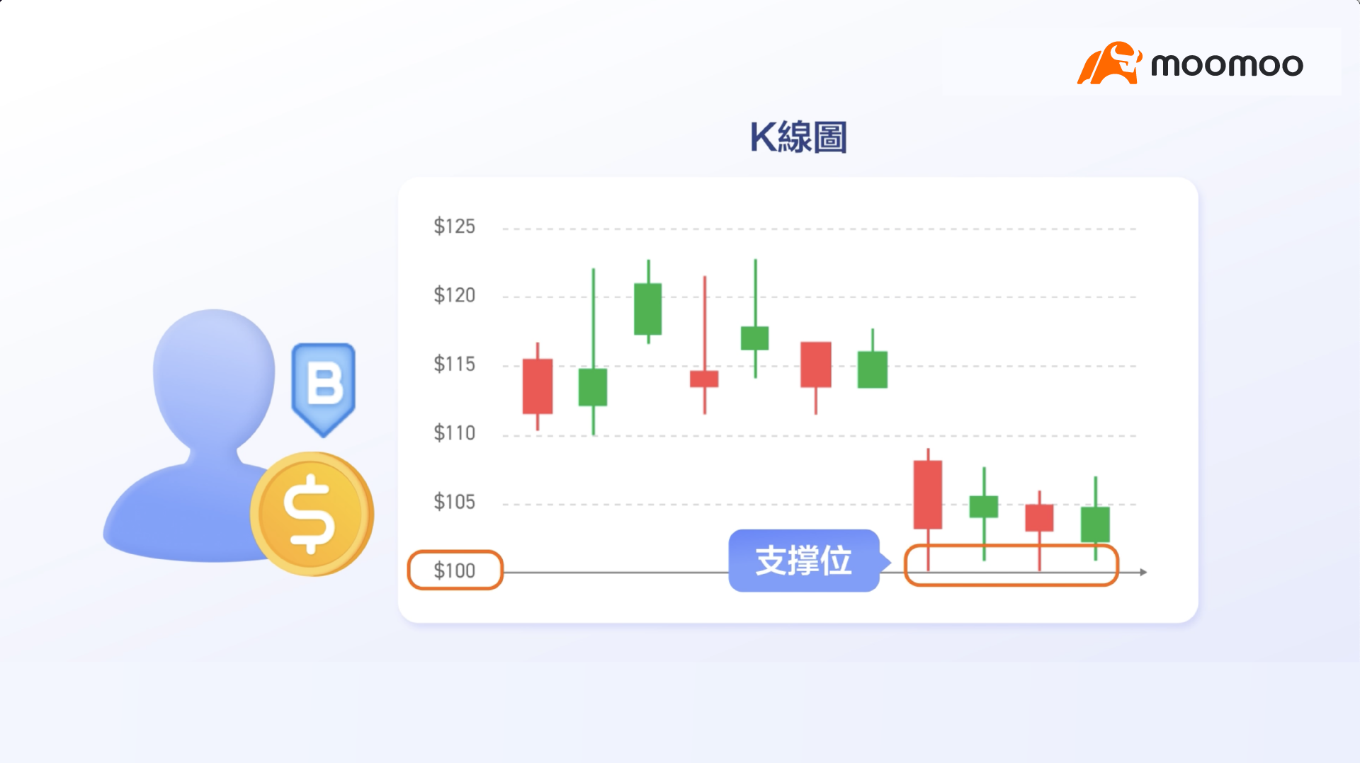
In this case, we refer to the $100 level as a "support level." Whenever the stock price approaches this support level, investors buy in, thereby preventing further declines.
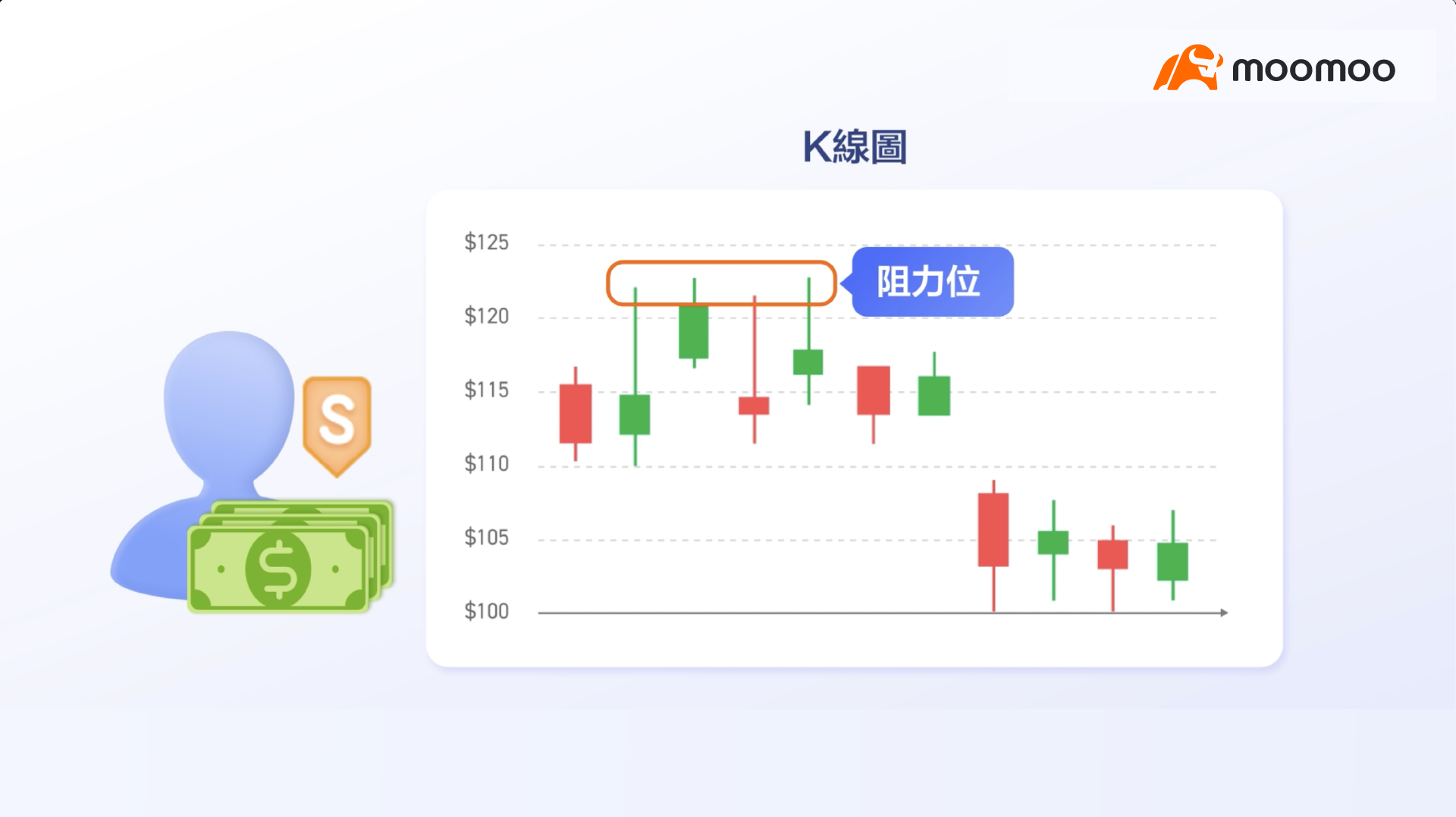
Similarly, if the stock price repeatedly attempts to break above a certain level but is rebuffed and falls back each time, that level is referred to as a "resistance level." Whenever the stock price approaches the resistance level, investors sell off, thereby preventing further rises.
Candlestick charts reflect the behavior of both buyers and sellers.
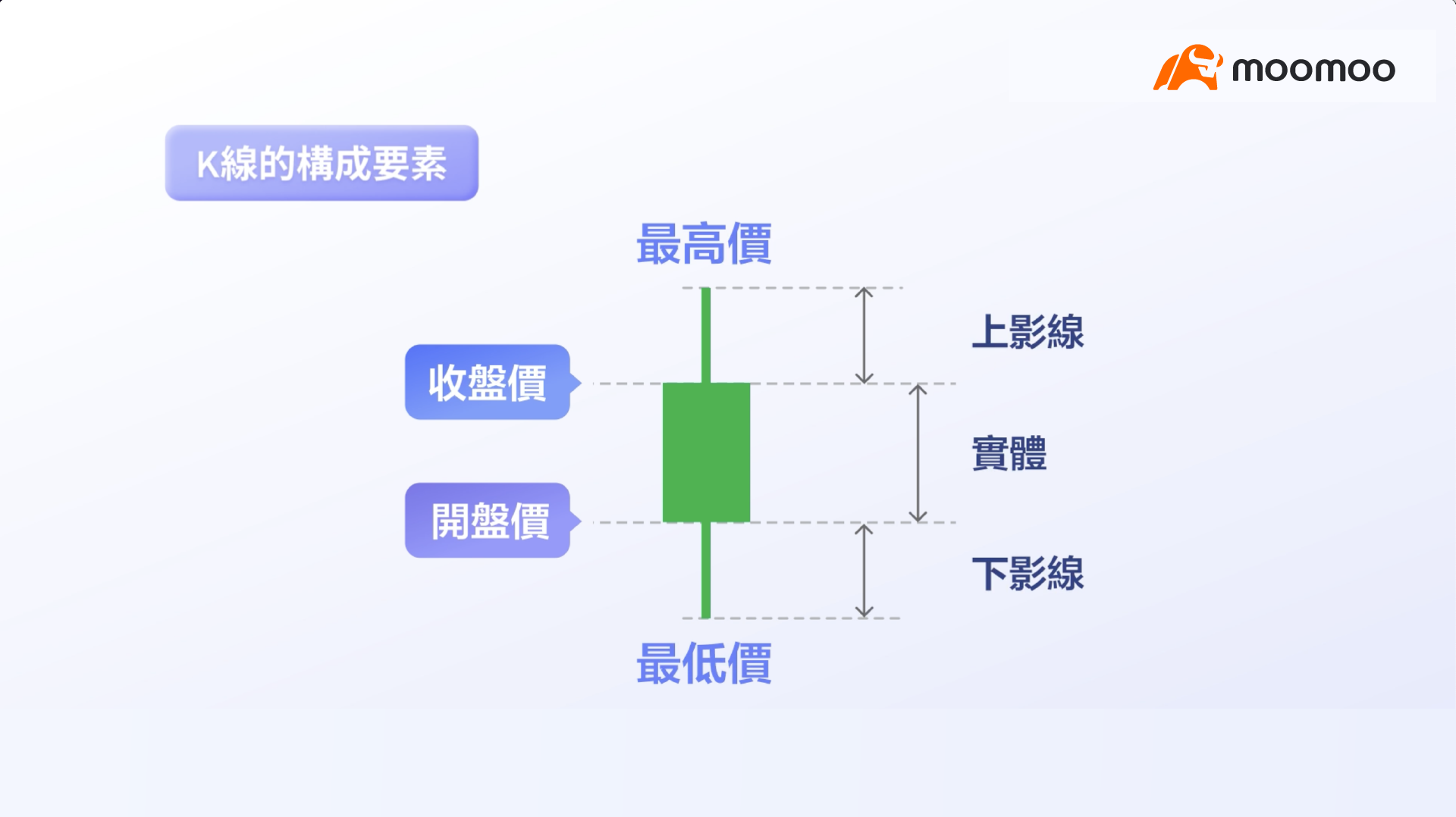
To interpret candlestick charts, one must first understand the three basic components of each candle: the body, the shadows (wicks), and the color.
In daily charts, the body reflects the opening and closing prices; the shadows reflect the high and low prices; and the color indicates the direction of price movement for the day.
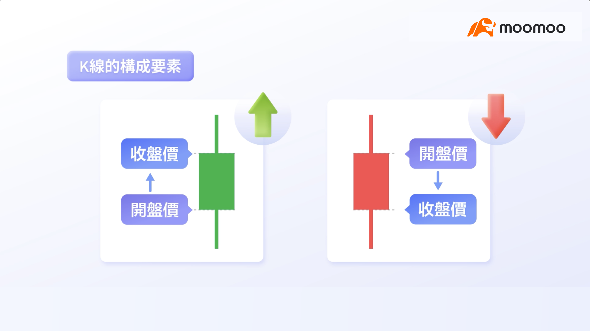
If the closing price is higher than the opening price, it is typically marked in green, indicating a bullish candle.
Conversely, if the closing price is lower than the opening price, it is typically marked in red, indicating a bearish candle.
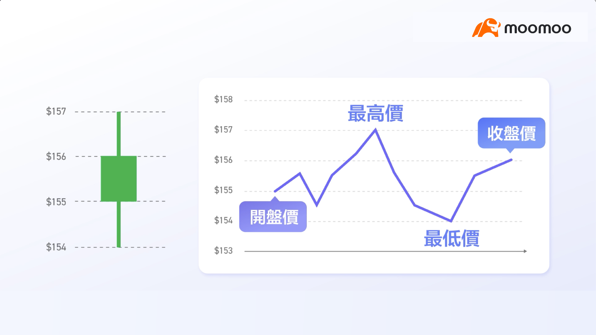
For example, if a stock opens at $155, closes at $156, with an intraday high of $157 and a low of $154, the day’s price action can be represented by such a green candlestick.
By observing the body, shadows, and color of candlesticks, we can quickly grasp the intraday volatility of stock prices.
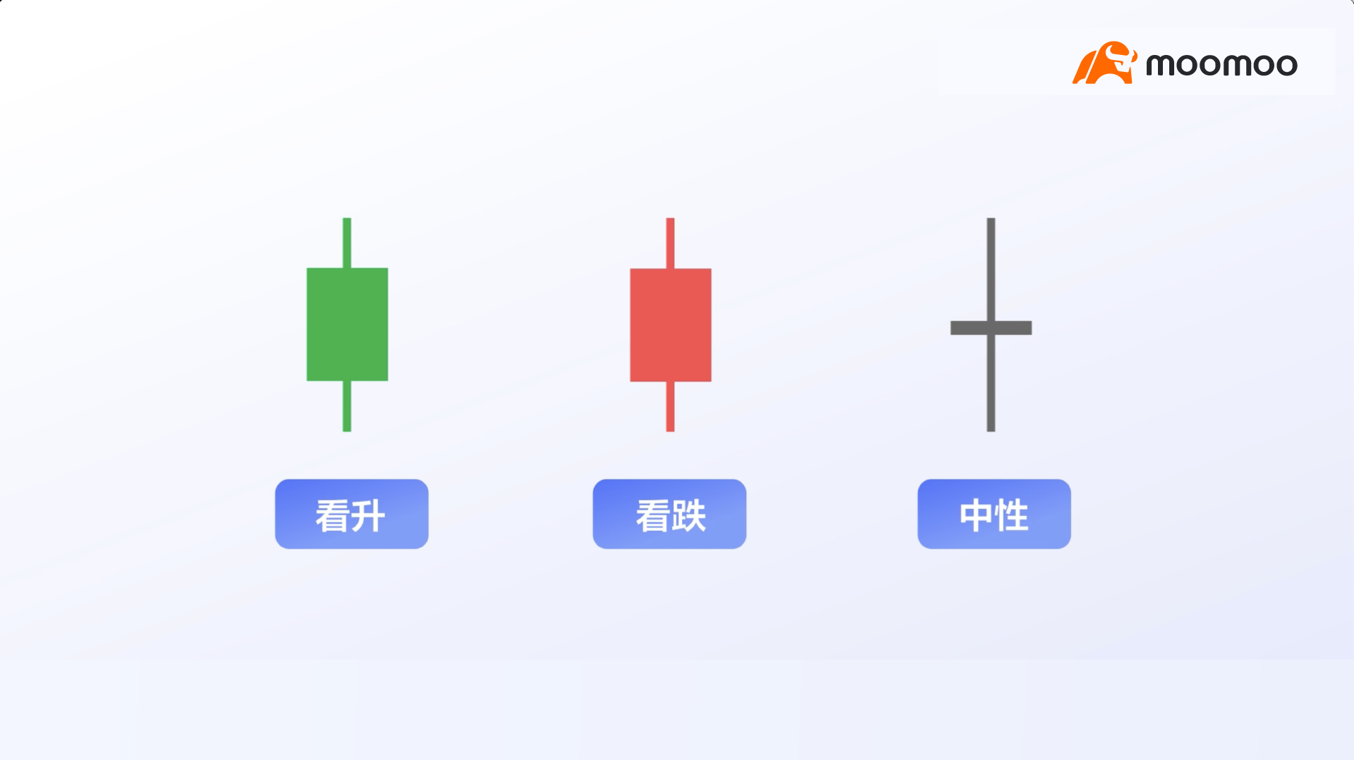
Each candlestick reflects the struggle between bullish and bearish sentiment among buyers and sellers.
Generally, these can be interpreted into three categories: bullish, bearish, and neutral.

A candlestick with a long body that fully dominates the range signals strong buying or selling pressure. This is because such candles typically indicate that buying or selling force was strong enough to drive the price significantly away from the opening level and sustain it until the close.
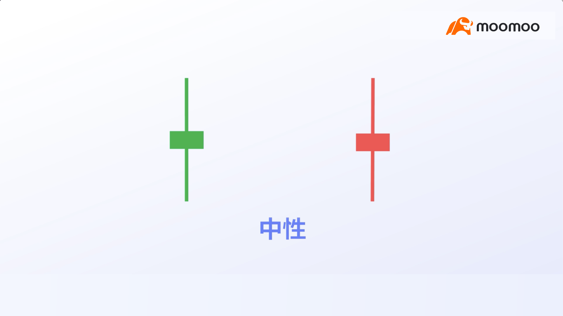
If a candlestick has long upper and lower shadows, it suggests significant stock price volatility. This indicates that the price experienced substantial gains and losses, but neither bulls nor bears were able to gain decisive control.
Therefore, this often sends a neutral signal to investors.
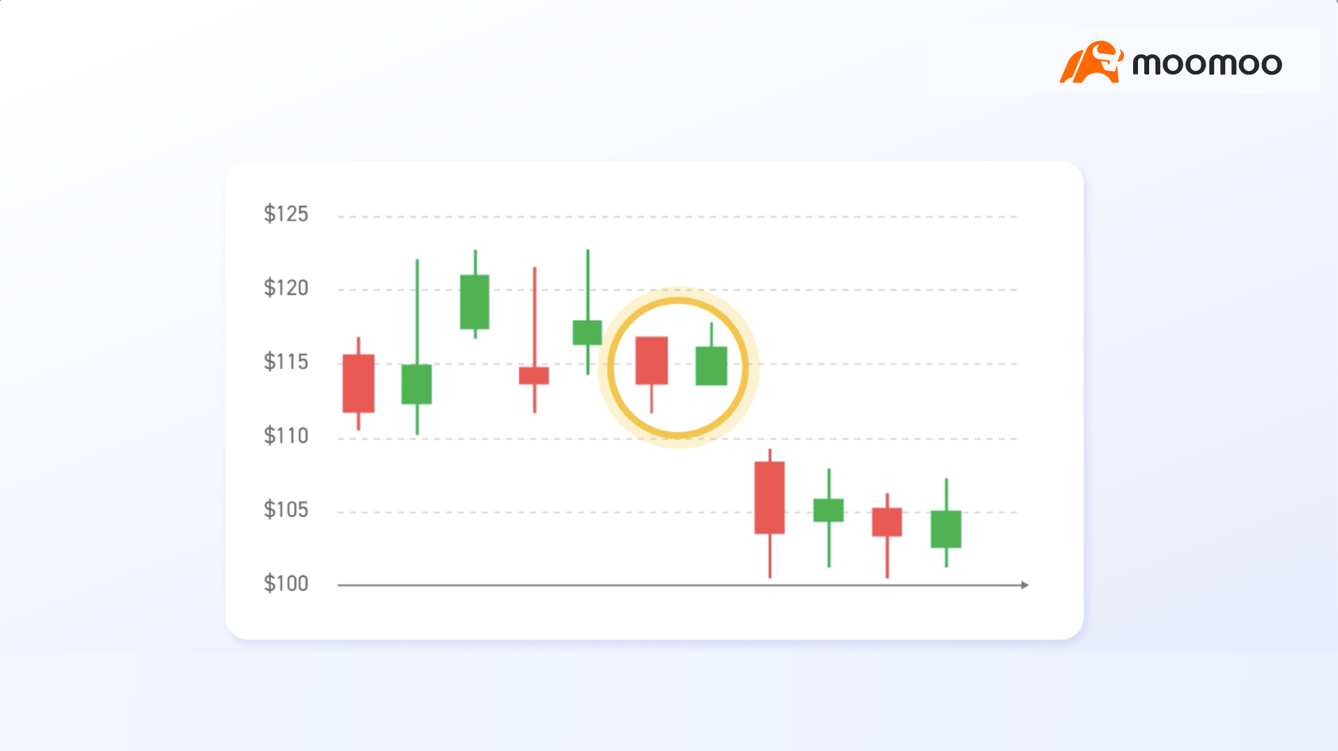
A single candlestick provides a general overview of intraday trading sentiment for a stock, while multiple candlesticks allow for the interpretation of more detailed information.
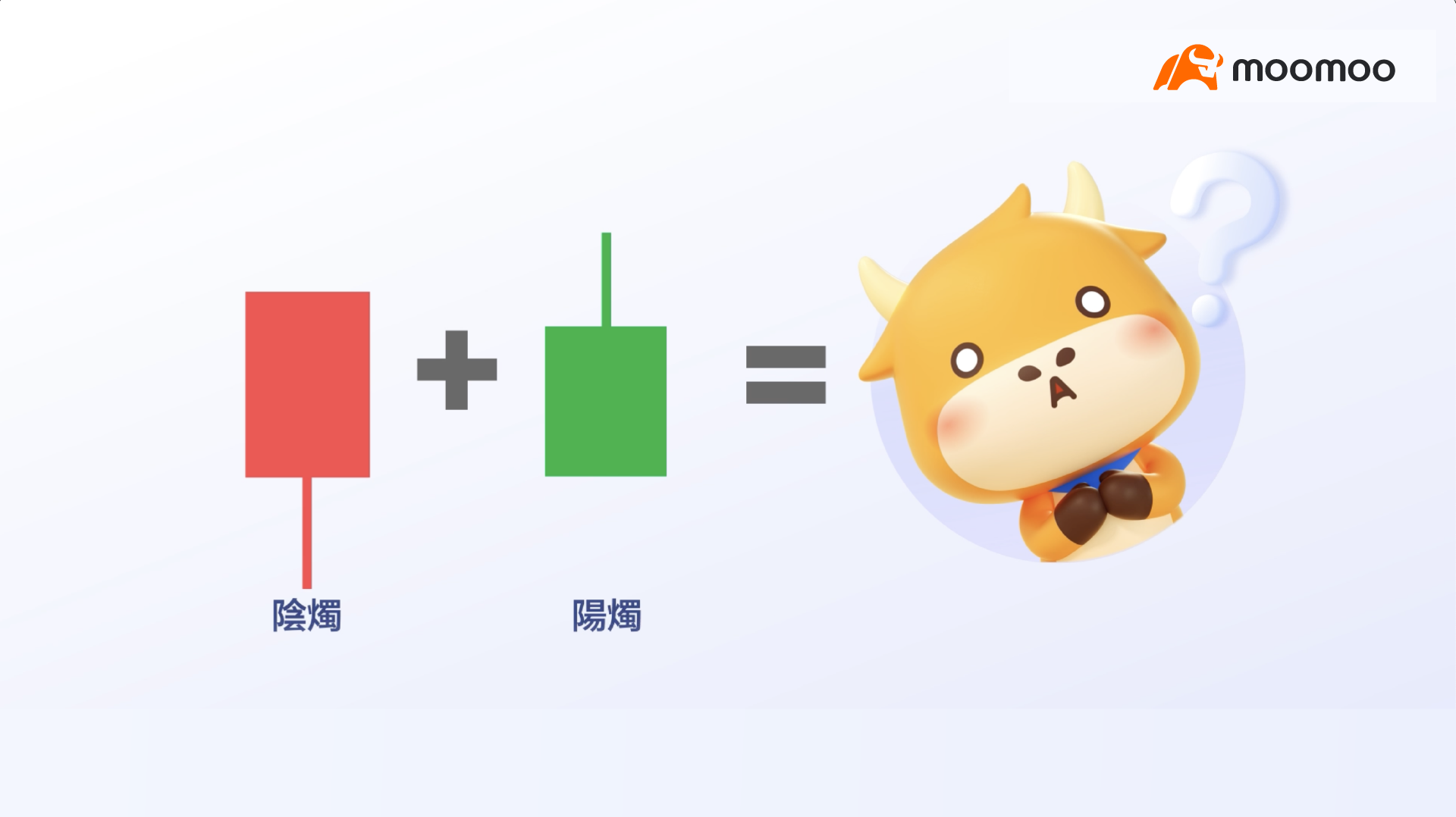
For example, let us examine these two daily candlesticks: one bullish candle followed by one bearish candle.
What would result if we combined these two candlesticks into a single one?

The combination yields a "two-day" candlestick, whose open, high, low, and close values reflect the price movement over the past two days.
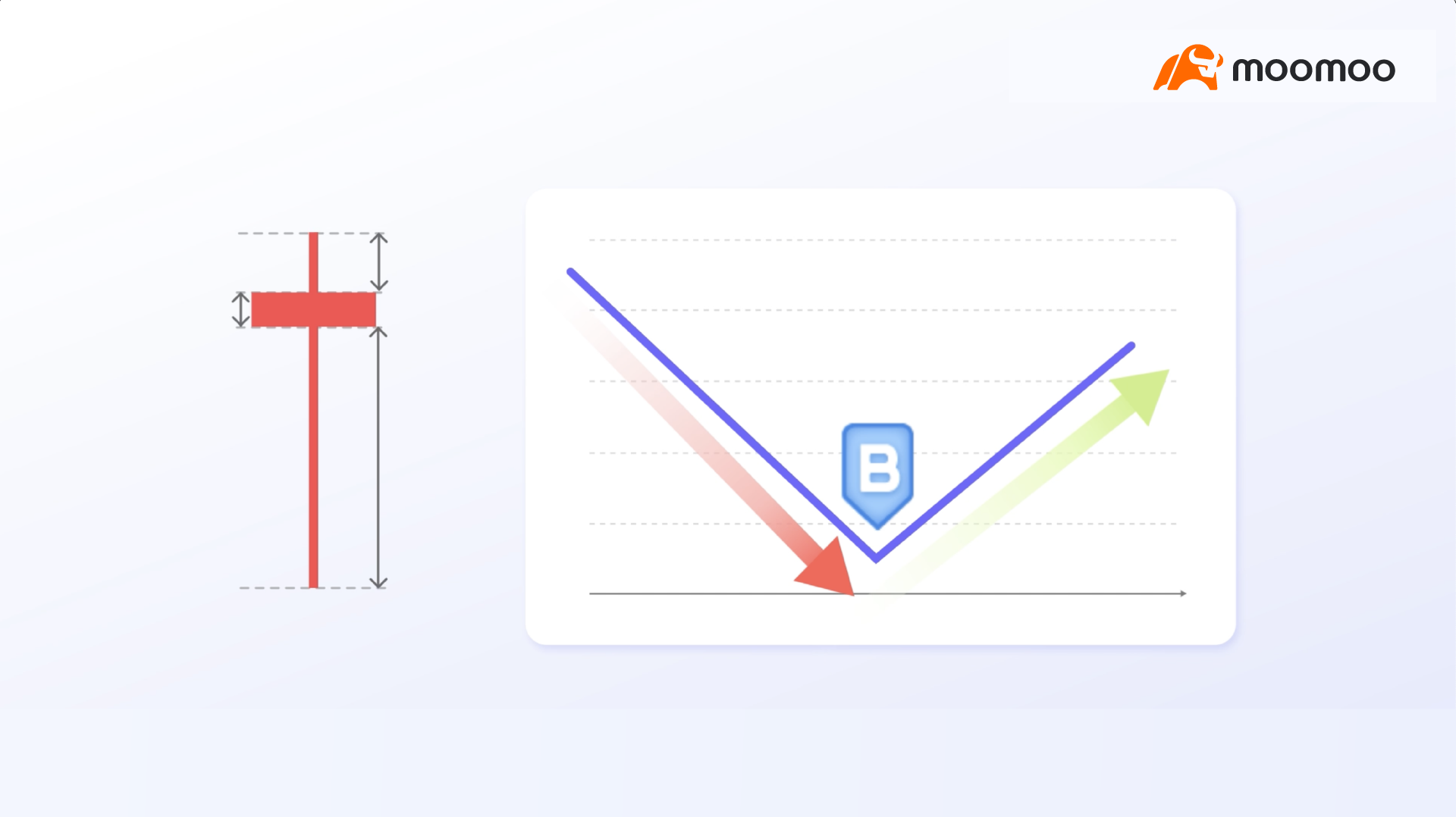
This "two-day" candlestick features a small body, a short upper shadow, and a long lower shadow. This indicates that over the two-day period, buyers entered the market to accumulate shares after a sharp decline, pushing the price back up.
This case demonstrates that switching candlestick charts to different timeframes can reveal significantly different underlying information.
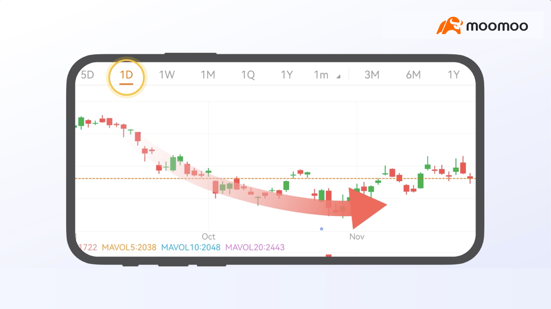
To further understand the essence of candlestick charts, let us examine another case.
Based on the daily chart of this stock, the price appears to be in a downtrend.
However, what happens if we switch to candlestick charts with longer timeframes, such as weekly charts?
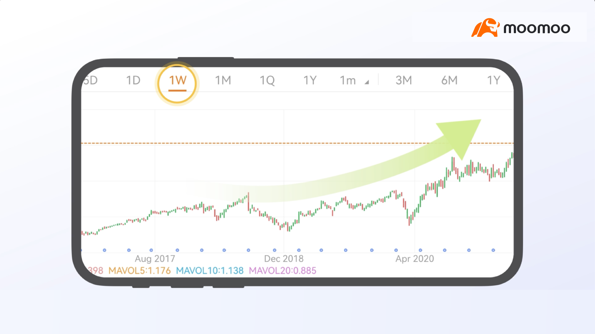
From the perspective of the weekly chart, the stock price appears to maintain an upward trend.
Therefore, by combining daily and weekly charts, we can broadly assess that the recent decline in the stock price may indicate a phase of consolidation rather than a downtrend or a reversal pattern.

Please note that while candlestick charts are useful for quickly interpreting market sentiment, they must be used in conjunction with other technical analysis tools to further confirm the overall trend.

How can we better judge market trends?
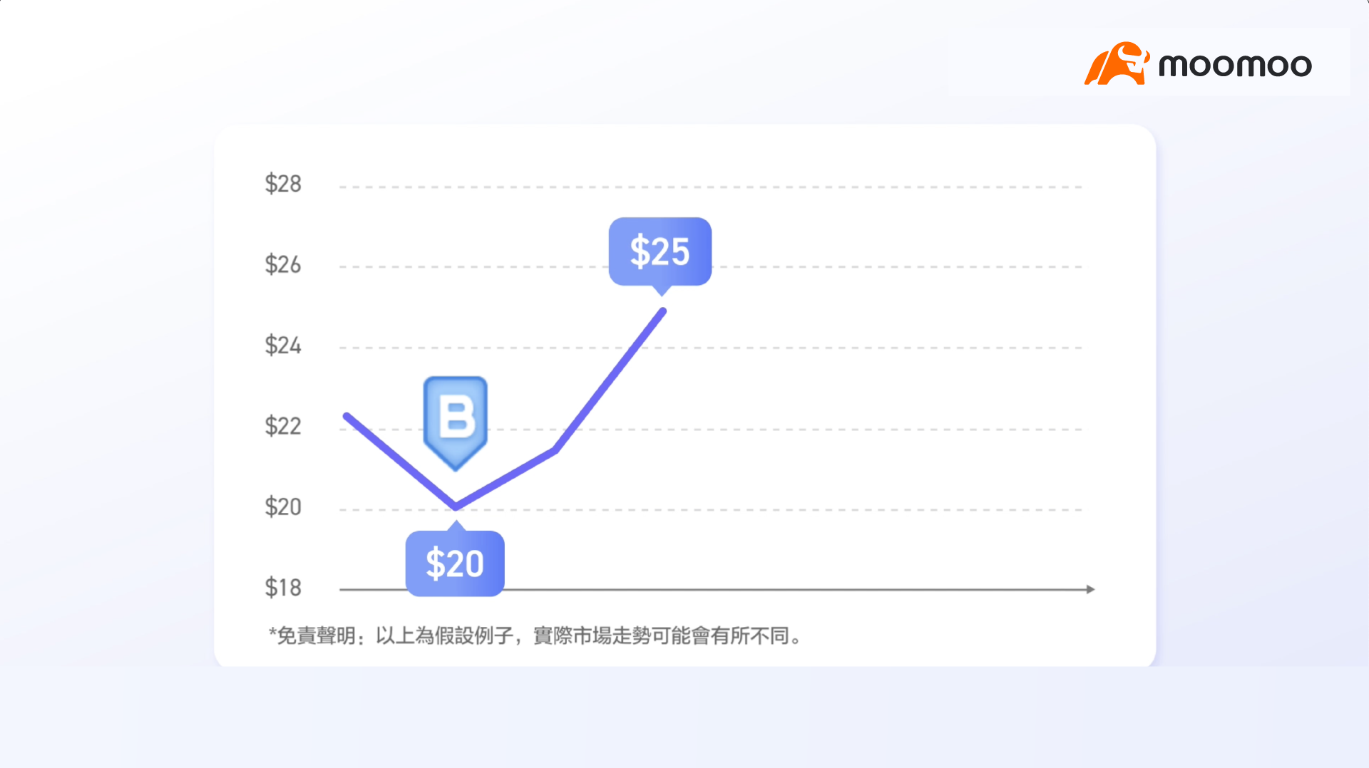
Have you encountered the following situations?
You bought a stock at $20, and it quickly hit a historical high of $25.
Confident of achieving greater returns, you continued to hold the position.
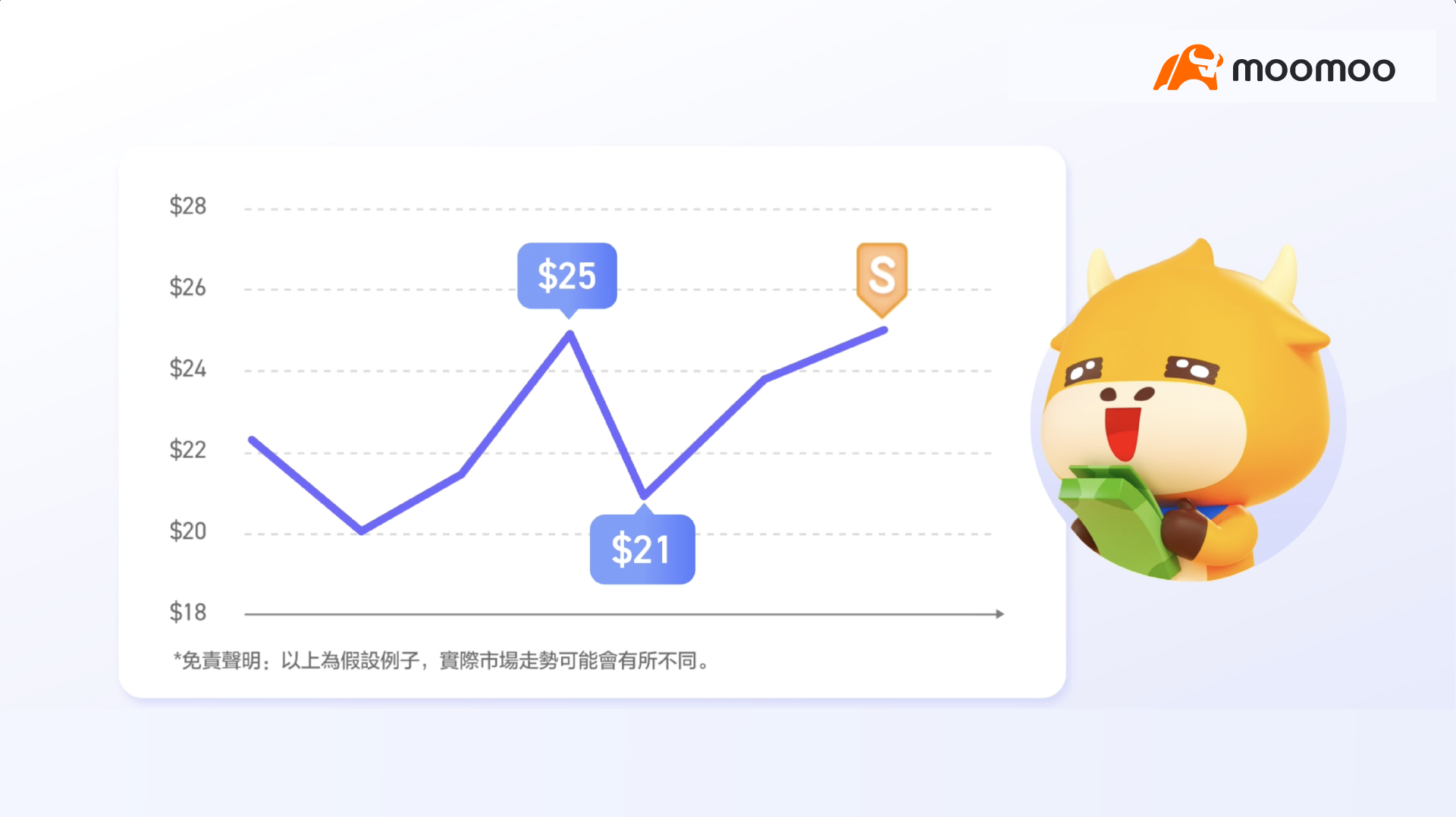
Suddenly, the stock price fell to $21, eroding most of your gains.
You began to panic but still managed to convince yourself to hold on until the next rebound.
When the price finally rebounded to $25, you sold your shares due to fears of another decline.
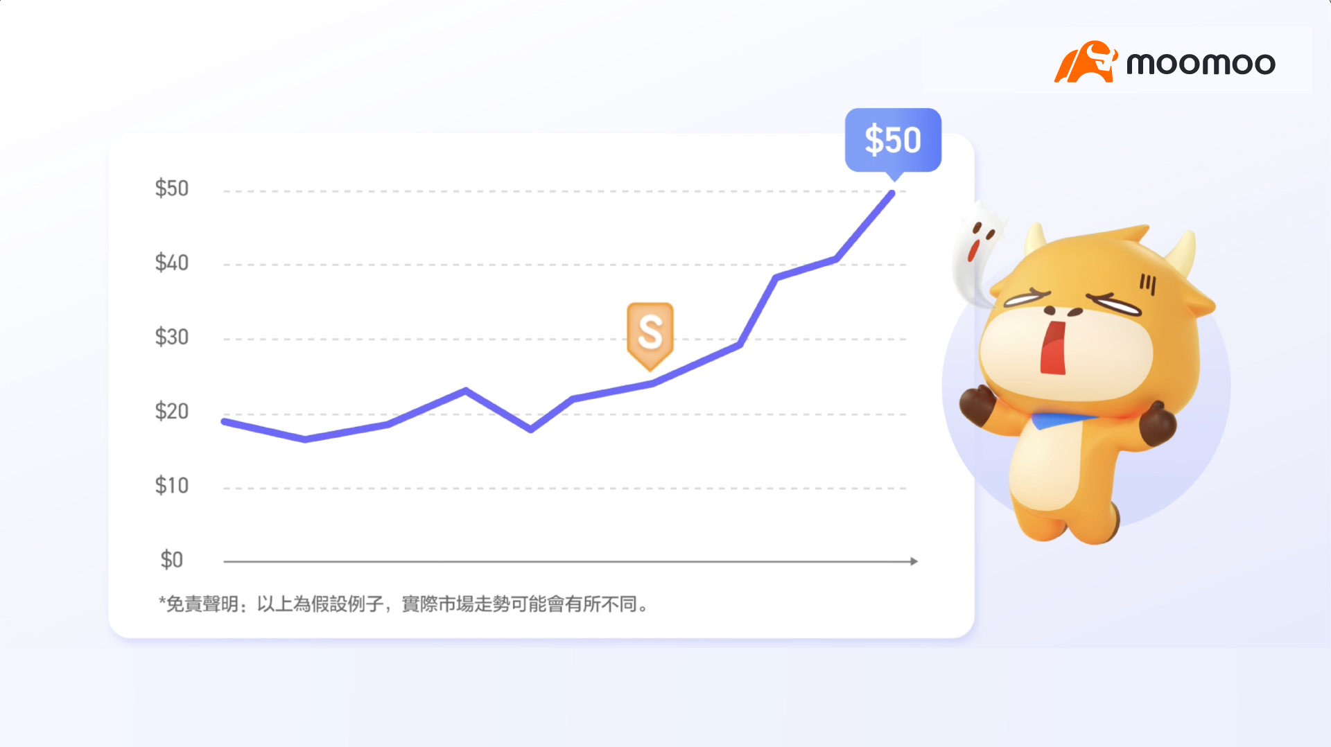
Guess what happened next?
The stock surged to $50 after you sold.

The good news is that you are not alone.
Many investors prematurely sell positions with unrealized gains, fearing that potential profits will quickly evaporate.

In fact, there is a well-known adage in the stock market: "Let your profits run."
This means that investors should resist the urge to sell off positions with unrealized gains too early.
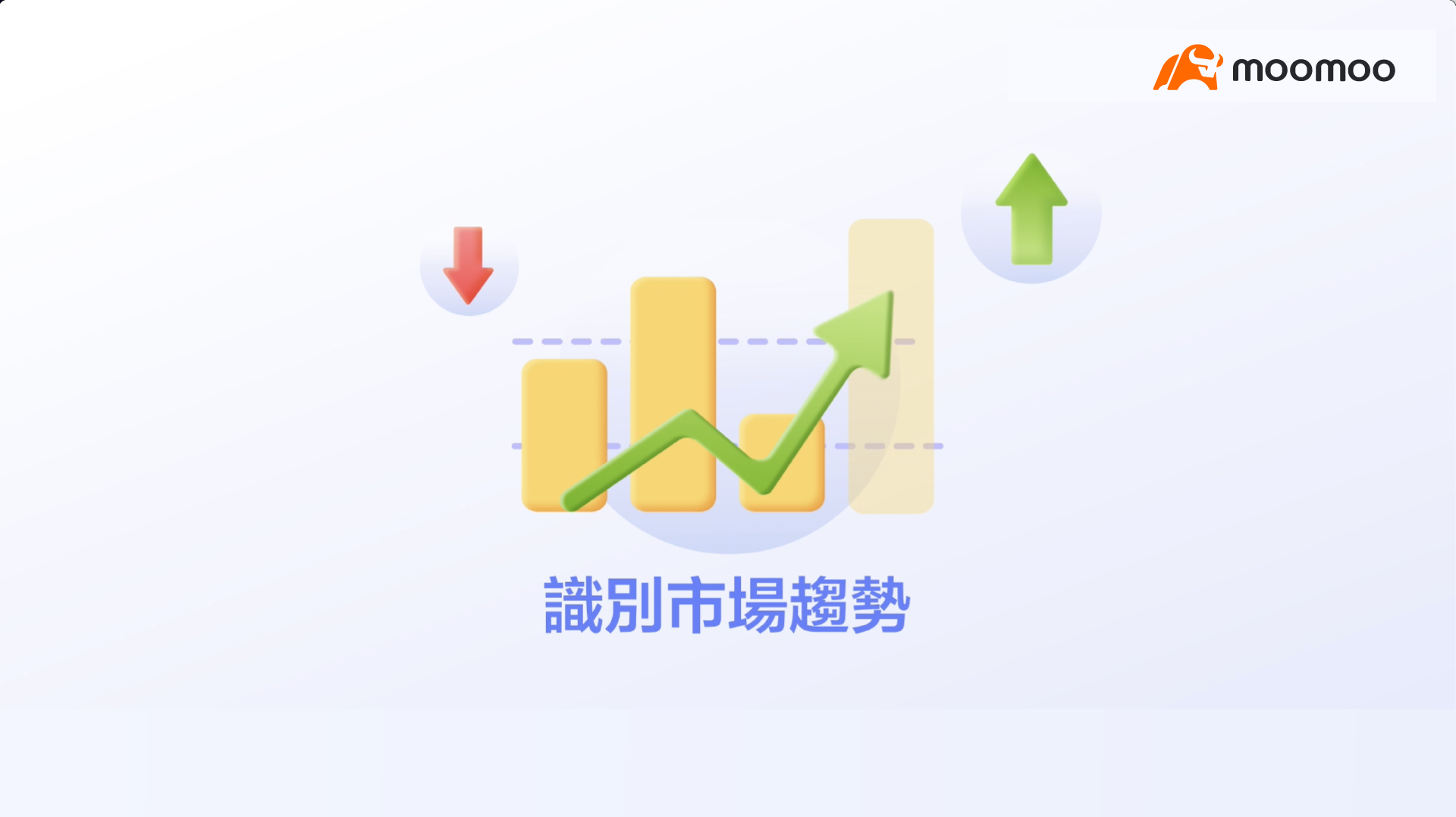
To do this, you need to learn how to identify market trends.

Market trends are like the weather.
In spring and summer, the weather is warm, and everything grows.
However, as autumn and winter arrive, temperatures drop, leaves fall, and plants begin to wither.
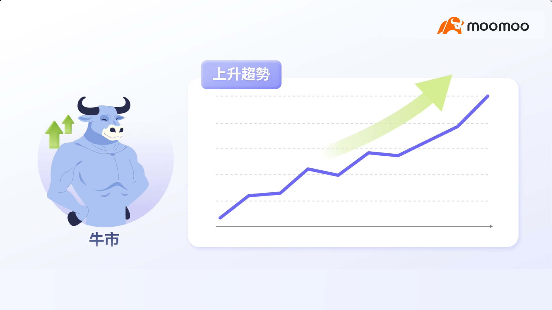
Changes in market trends are remarkably similar to changes in weather.
When the stock market is in an uptrend, investors remain optimistic, anticipating that stock prices will continue to rise.
This is what we refer to as a bull market.
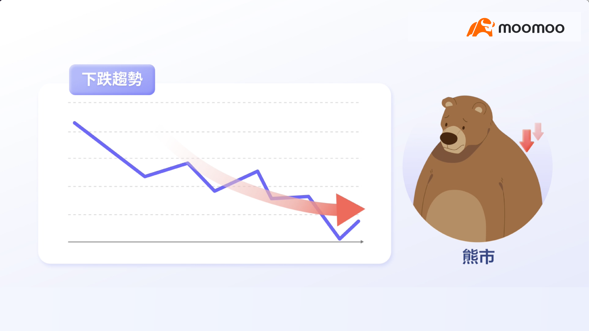
When the stock market is in a downtrend, even high-quality stocks decline, and pessimism spreads throughout the market.
This is what we refer to as a bear market.
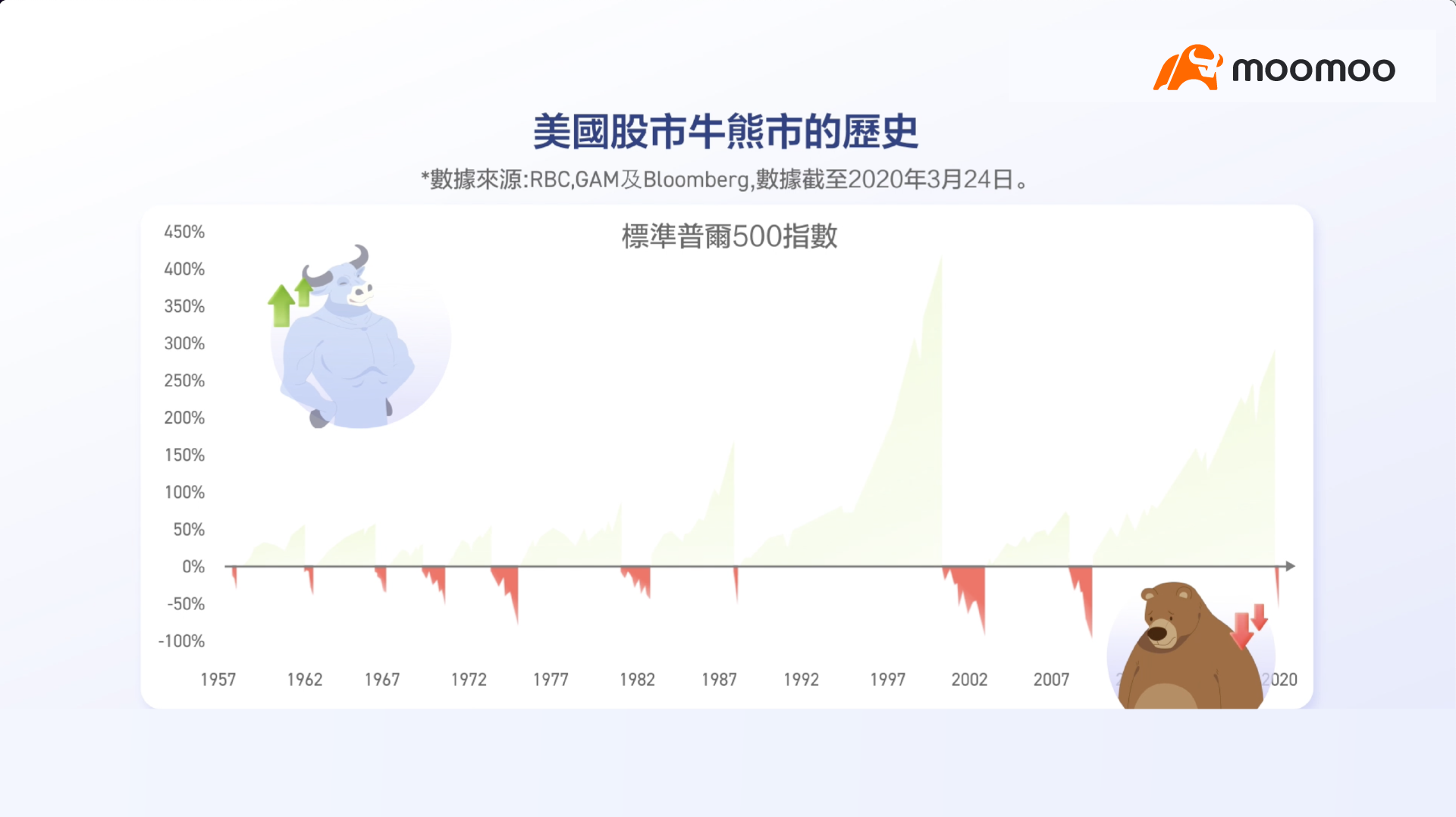
A review of the U.S. stock market over the past 70 years reveals that it has been characterized by alternating bull and bear markets.
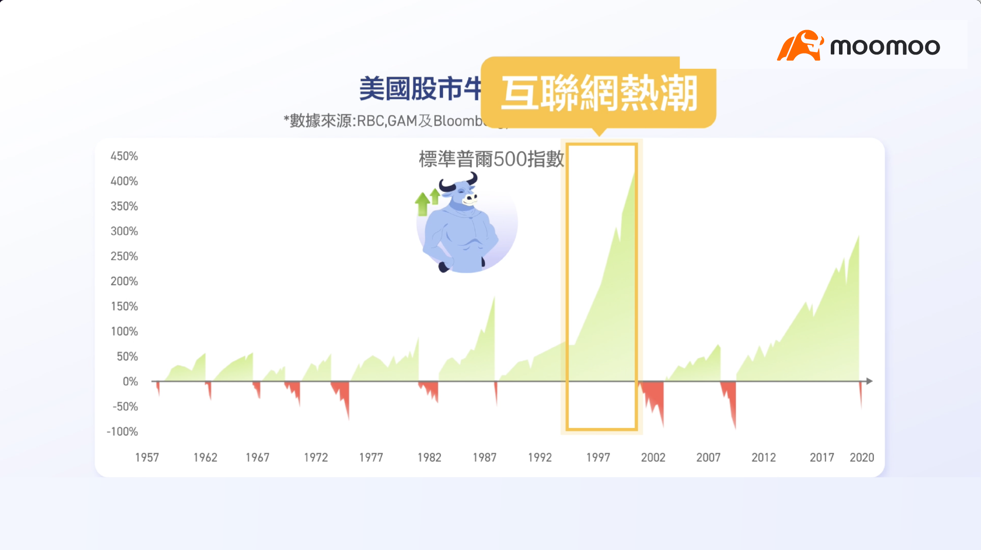
For instance, the internet boom of the 1990s was a typical bull market.
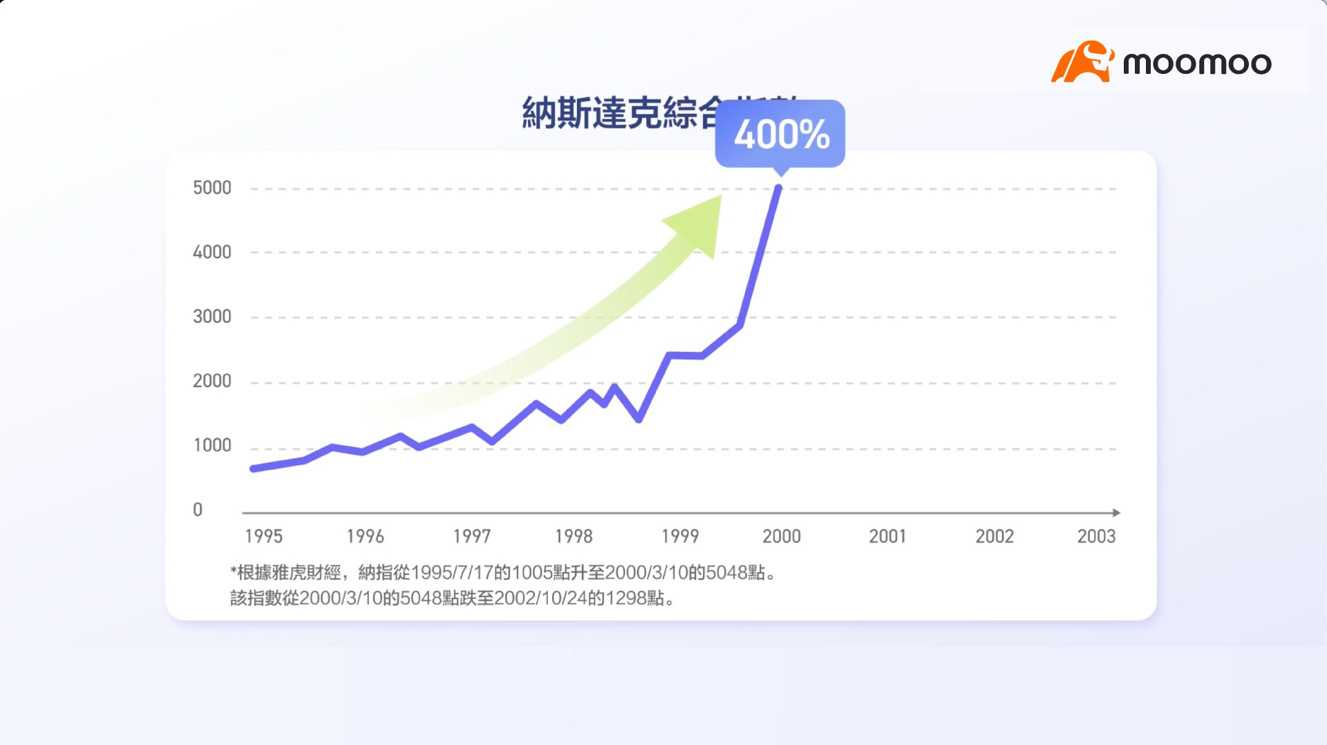
From 1995 to March 2000, the Nasdaq Composite Index rose by more than 400%.
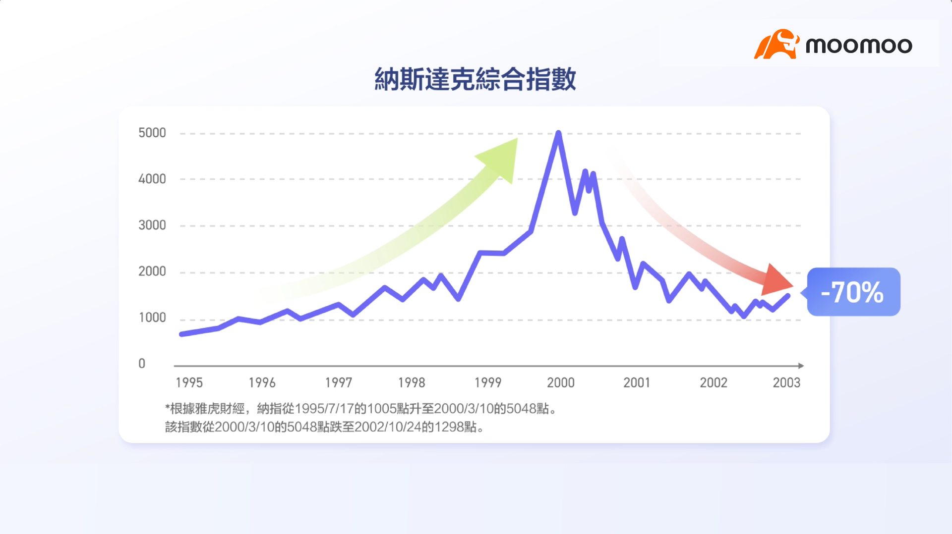
However, the dot-com bubble burst in 2000, followed by a bear market that lasted for several years.
By October 2002, the index had fallen more than 70% from its peak.

Renowned trend trader Ed Seykota once said, “The trend is your friend until it bends.”

This explains why identifying market trends is so important.
By following trends, traders can make better buying and selling decisions.
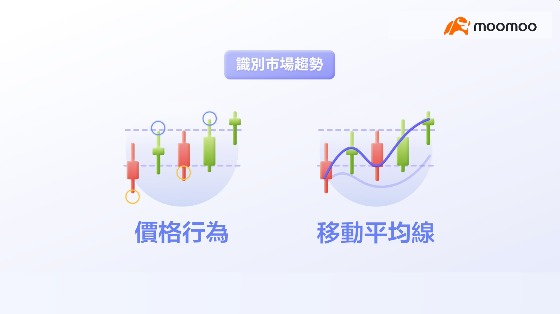
There are two useful technical indicators for identifying market trends: price action and moving averages.
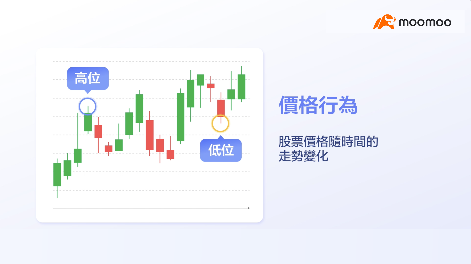
Price action refers to the movement of stock prices over time.
As stock prices fluctuate up and down, they form a series of highs and lows.
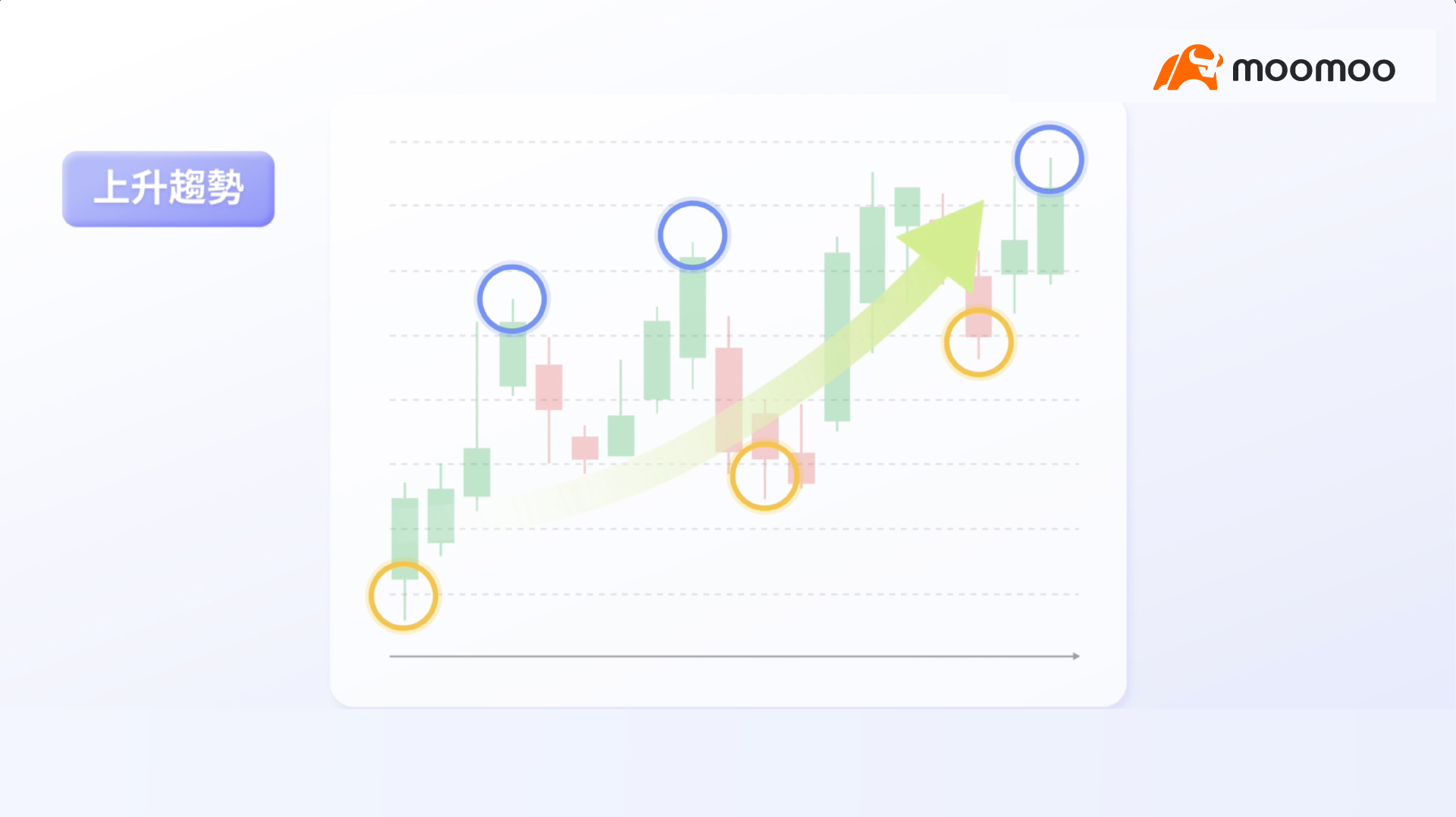
If both highs and lows are rising, the stock is in an uptrend.
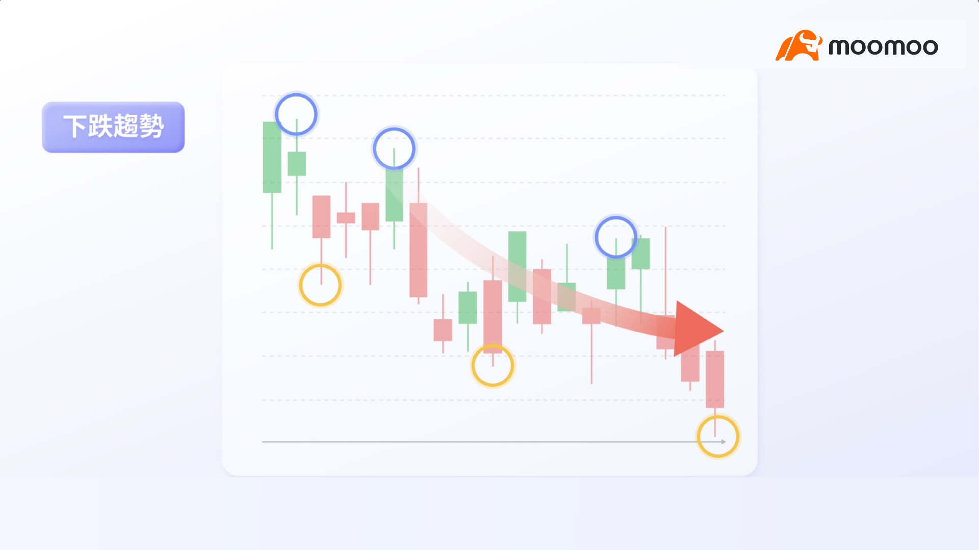
If both highs and lows are falling, the stock is in a downtrend.
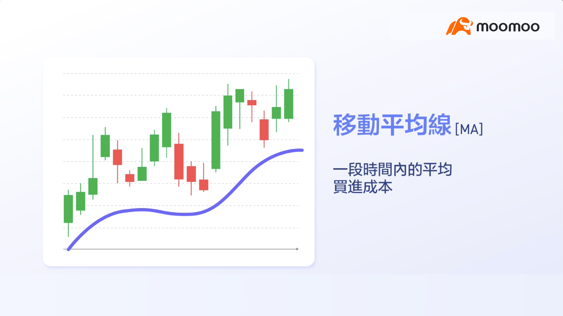
Another method for identifying market trends is to use moving averages.
The moving average represents the average cost basis of purchases over a specified period.
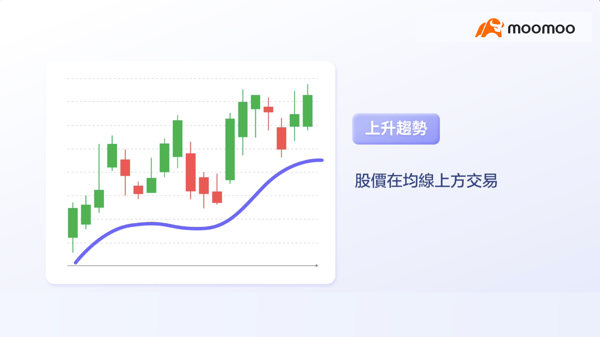
If the stock price consistently trades above this line, the stock is in an uptrend.
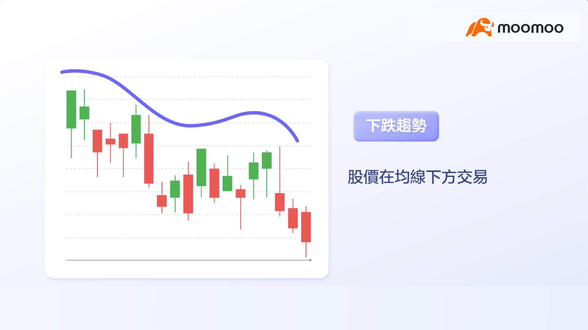
Conversely, if the stock price remains below this line, it indicates a downtrend.
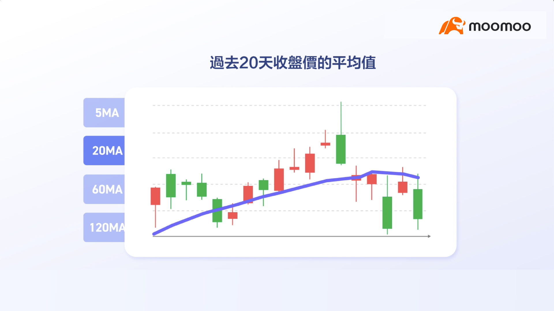
The time frame for the moving average can be customized.
For example, a 5-day moving average reflects the average closing price over the past five days.
A 20-day moving average shows the average closing price over the past 20 days.

The 5-day and 20-day moving averages can be used to observe short-term trends.
To analyze long-term trends, other time frames can be selected, such as the 60-day or 120-day moving averages.

In summary,
Tracking market trends is crucial, and price action along with moving averages are two key indicators for identifying these trends.
Congratulations on deepening your understanding of equity trading!
In the next chapter, we will introduce additional useful strategies for beginners.
This presentation is for informational and educational use only and is not a recommendation or endorsement of any particular investment or investment strategy. Investment information provided in this content is general in nature, strictly for illustrative purposes, and may not be appropriate for all investors. Read more